You may notice when you look at my art that it is often quite muted and earthy in colours, and that is a by-product of the materials I choose to use. I love bright colours in my personal life, but for my work I’ve chosen to go with a more muted colour palette, as it’s often better for myself, others and the environment. I prefer to keep my sustainable footprint as small as possible by working with found, recycled/rescued or upcycled materials where I can, and in particular ones that were made with as few harmful dyes as possible.
Of course, sometimes nature provides a way of working that gives spectularly pure colours (I’m looking at you, indigo), and some of the materials I’ve used happen to have been bright pops of colour, such as the off-cuts of industrial faux-leather I’ve used in my bags in the past. More often though the less harmful dyes are of course, more earthy. I have used un-bleached cotton and linen in things like my zipped pouches (I’m working on a new range!), which instead of bright white gives a lovely warm beige. Paper from recycled pulp is also often of mixed fibres, resulting in natural melange of soft colours. I also love working with recycled paper for my lino prints and the handmade cards.
Unbleached cotton for one of my hand-painted zip pouches
My pregnancy this year spurred me to make a change to my watercolour paint palette too. After a bit of research I am happy to have found what seems to be quite a varied palette with some rich colours, which is still less toxic to Baby Q and myself. Out went the obvious Cadmium hues and a few of the ‘older’ pigments (they’ve developed safer ones now). You can see a few changes I made in my swatch below. Scribbles look super professional, I know.
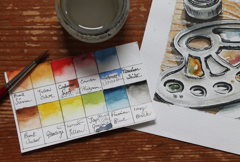
My adjusted palette swatches.
It’s not perfectly safe, but at least I’ve chucked out some of the scarier ones. No Vermilion-induced birth defects for us (it contains mercury)! I’d love to hear from you if you know any good resources for checking what are ‘safe’, or relatively safe pigments.
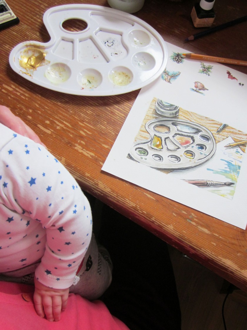
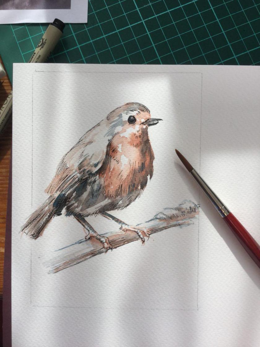
Here’s a recent painting I did for this year’s Christmas cards (the robin one was a very limited run… it’s sold out!)-
My biggest bug-bear is that I miss a bright red. The other hues in my core palette are very lovely, as is Indian Red (or Light Red, as named by some brands), which is the red I’m currently using. You can see the swatch tucked under where I’ve crossed out ‘Cadmium Red’, which I’ve stopped using. Light Red just misses that… pizazz that Cadmium has, and tends to muddy other colours when mixed. Light/Indian Red also varies from brand to brand. So again if anyone knows of any brighter, relatively safe reds, please let me know!

")
")