UPDATE JUNE 24– We’re taking a break now with workshops ’til after the summer, to be notified when the next workshop is lined up you can ‘follow’ me as organiser on Eventbrite ‘here‘ and it’ll let you know when my next event is on!
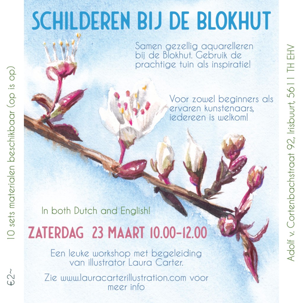
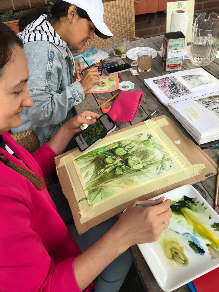
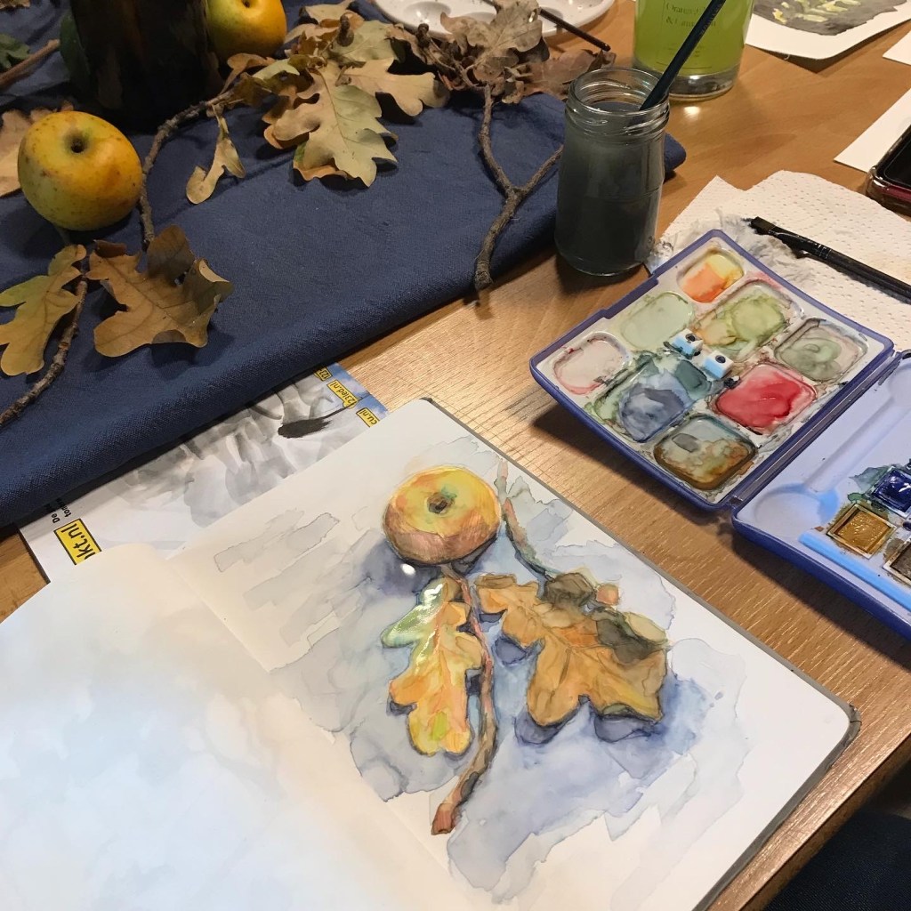
The botanical painting workshops (just €2 suggested donation for materials!) are back at the Blokhut, Ehv. Come and take some creative time for yourself, and all abilites are welcome. I’ll be giving tips and tricks! The first date is Saturday 23rd March, 10.00-12.00.
Open for beginners and experienced artists. This will be a guided workshop, with tips and tricks. Use the lovely garden, as well as spring botanicals, as inspiration! We speak both Dutch and English. Everyone is welcome!
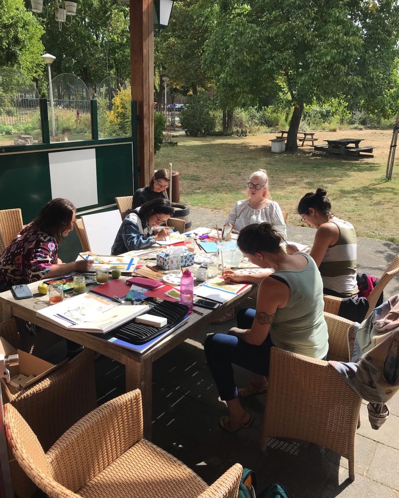
They’re always fun sessions, with people from all different backgrounds.
Signing up first is appreciated (here), as it helps us set up easier.
I’m rounding up the first leg of what will hopefully be an expansive project for me, as it has so much life in it and covers some of my favourite loves: books, vintage ephemera, environments and the wonderful worlds we find ourselves in when we read. Here’s a look at some of the process…
The 2024 Biblioscapes wall calendar is about to become available to order (my newsletter will keep you updated!), and my favourite six of the illustrations will be released as prints and postcards in the shop.
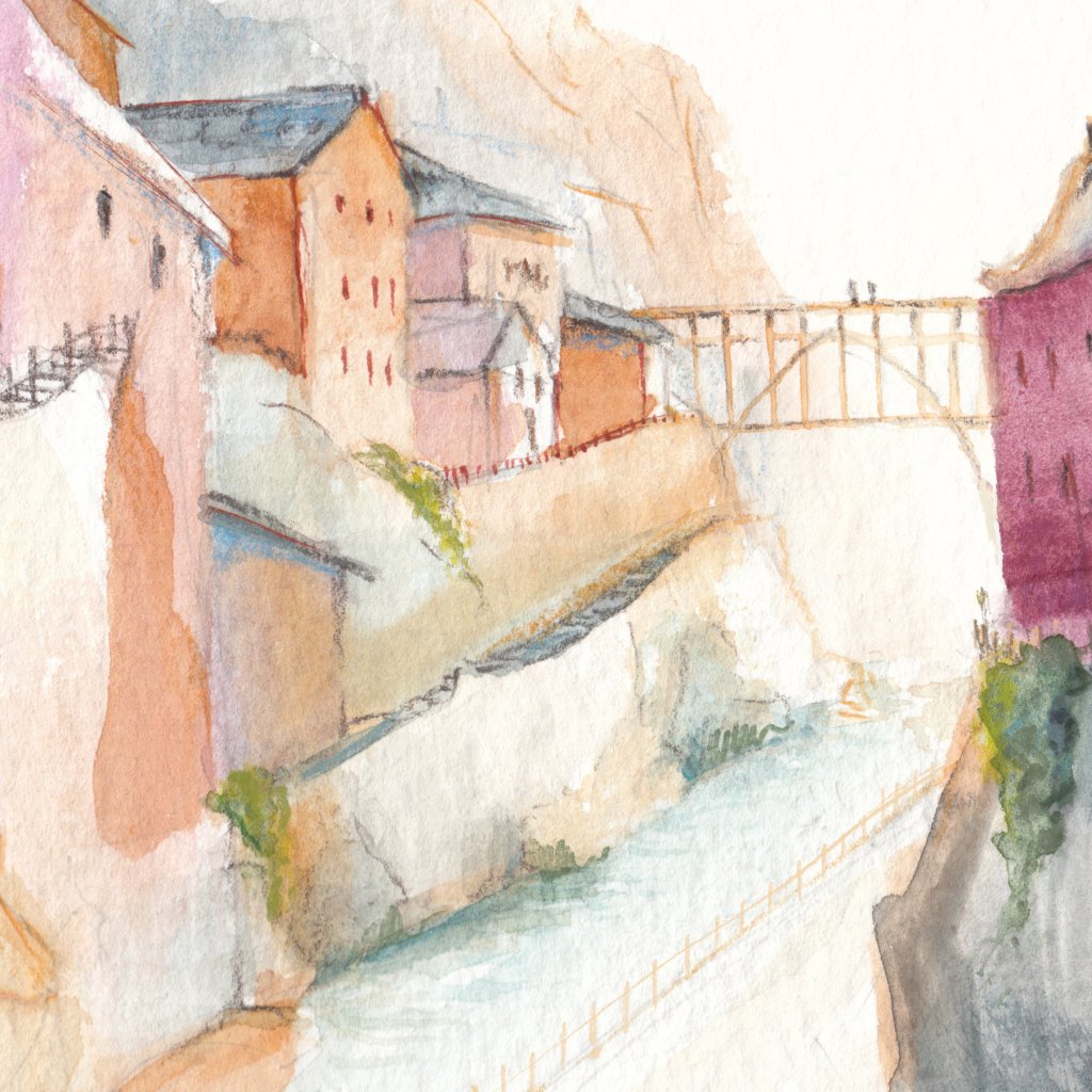
I’ve looked at so much reference from vintage travel ephemera, maps, and guides that I was stumped with what not to include, and had a terrible time keeping the design simple.
The first video showing my first research stage is here, the development for the watercolour landscapes is here, and you can see more development here.
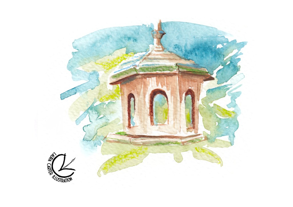
The actual illustrations were pretty straightforward, as some of these places have lived in my head for years, originating of course in stories and the works of others. I’m sure you can all relate to some of the locations and might be able to ‘place’ a book it might belong to. Using my experience of illustrating the natural world the scenes were fairly easy to realise, though I’ve never painted a ‘galaxy’ scene before.
Three unfinished landscape snippets
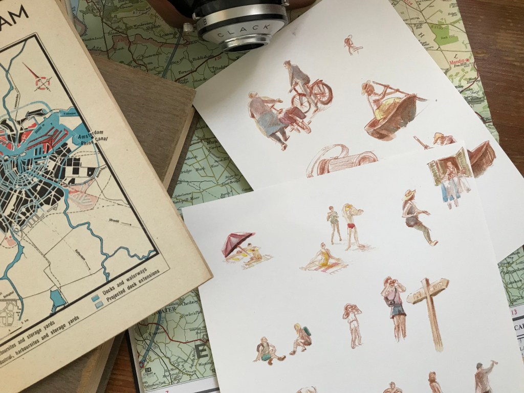
I found portraying ‘tourists and locals’ from each scene more challenging. I didn’t want to go in to the minutiae of the world too much, as so much of this is done in your own head whilst reading. I kept the canvas fairly sparse for the viewers imagination to populate. I’ve even played with the scale, as just with dreams, a literary world can become larger than life.
I developed the figures last, as a way to avoid adding too much detail. Here’s the process-
Character sketchesTinted charactersResidents
I had to go and do a bit of urban sketching first to observe what sort of details are visible from a distance, as they would be quite a small scale compared to the size of the environments. Facial features disappear, and it becomes largely about silhouette and tone. I did laugh to myself drawing the characters! Tourists have a special something, don’t they? They were mostly worked from photos and my imagination. It’s been ages since I went to life drawing so it was quite tough.
As a trained illustrator and a life-long lover of books (my job working in a bookshop was often a dream come true!) this project has been a wonderful challenge. I hope you enjoy viewing it as much as I did making it. The final illustrations will be found in the ‘Illustrations’ section of my Portfolio, once the calendar is available for sale.
There are so many more ‘genres’ of literary landscape I’d love to capture on paper, who know how extensive this series will become!
We’re organising another botanical watercolor painting workshop in Eindhoven, in the lovely Irisbuurt Blokhut. Come join us on Saturday 30th September, from 10.00-12.00!
Please drop me a message or RSVP to the event on Eventbrite if you can, it helps with planning! The event is listed as ‘free’, but €2 donation on the day would be much appreciated!
English// (Dutch below)
Open for beginners and experienced artists. This will be a guided workshop, with tips and tricks. Use the lovely garden and prepared botanical elements as inspiration! We speak both Dutch and English. Everyone is welcome!
€2~ per person (cash or card), coffee/tea included.
Use our watercolour materials (10 sets available, first come first served) to make a couple of paintings of the lovely garden or the prepared botanical elements with an Autumnal feel that we will place on the tables for you to study. Alternatively, bring your own painting equipment and inspiration pictures. Materials for tonal sketching will also be available. We’ll go ahead even if it’s raining, we can sit under cover and if it’s cold, inside.
PLEASE NOTE: It is paid parking in the neighbourhood, except the nearby Lucas Gasselstraat. The first hour of the Jumbo carpark is also free.
See you there!
Previous painting workshops
NL //
Samen gezellig aquarelleren bij de Blokhut. Gebruik de prachtige tuin en botanische elementen als inspiratie!
Voor zowels beginners als ervaren kunstenaars, iedereen is welkom!
Wij spreken zowel engels als nederlands. 10 sets materialen beschikbaar (op is op)
Schilderen wat je wilt, en ik ben er als professionele illustrator aanwezig om tips te geven.
Ook met slecht weer gaat het door (er is een overgedekte ruimte en binnenruimte beschikbaar)
€2~ per persoon (contant of betaalpas). Koffie/thee inbegrepen.
Alstublieft RSVP voor het evenement op Eventbrite, dat helpt met plannen, dankjewel (op Eventbrite staat dat het evenement gratis is, maar ik zal die €2 betaling op de dag heel fijn vinden)!
Let op: Betaald parkeren in de buurt, wel gratis parkeren op de Lucas Gasselstraat, en de eerste uur bij de Jumbo parkeerterrein is gratis.
I’m going to be sharing more of my art-making and design process here, as well as my tips for anyone who’s interested.
My Patrons get full details on the process as it happens, as well as invitations for their input, and my newsletter gives a monthly run-down of the best bits as well as a heads-up on when things will be available to purchase in my shop.
I’ll be using this space to curate the processes of my most interesting and juiciest projects, and sharing any experience that I think may come in handy to anyone else. I know I’m always eager to see the design process of other illustrators, out of curiosity and to see if I can pick up any useful tips.
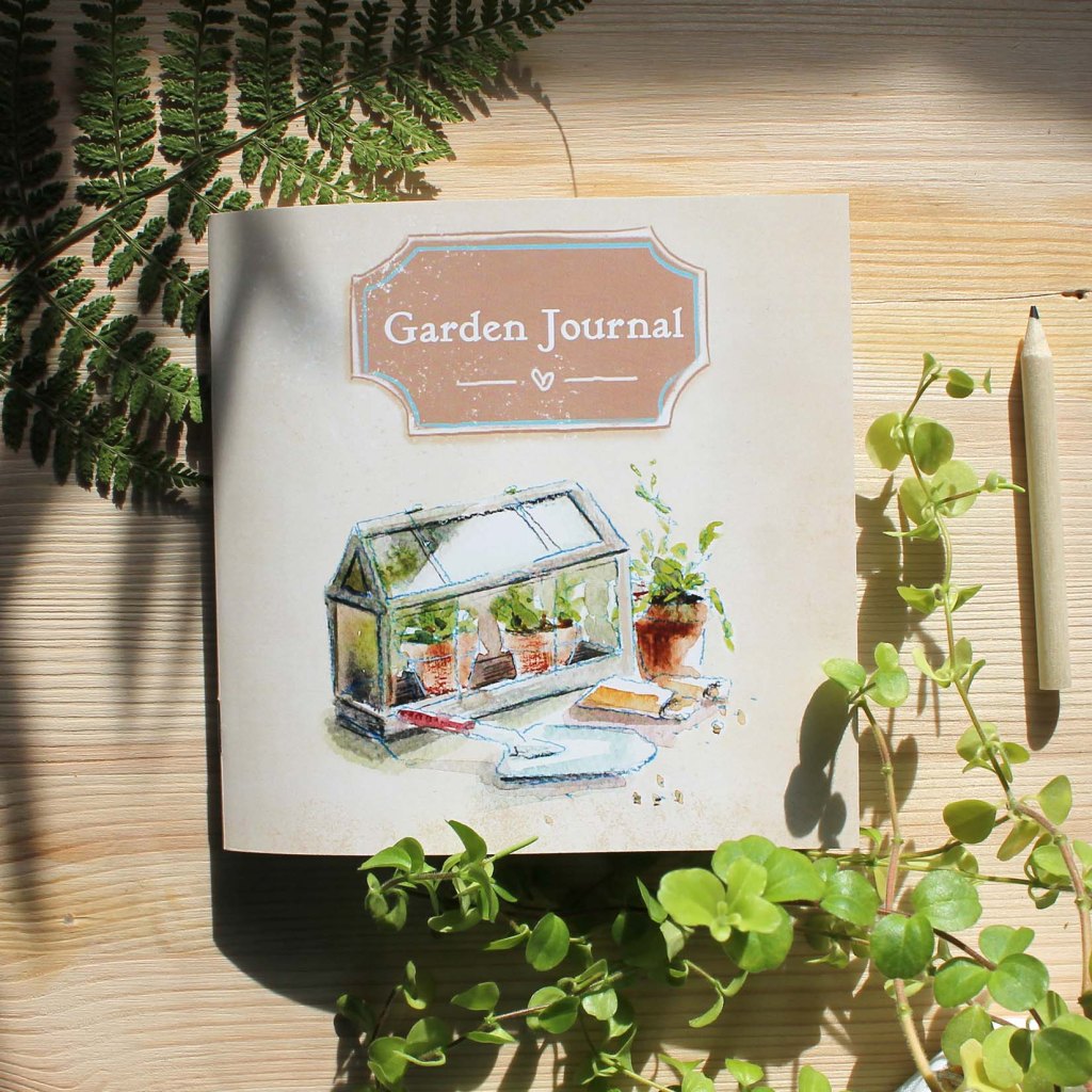
I’ll start with my pocket Garden Journal. This was a self-initiated project that I made basically because I wanted to use it myself!
Run-down of Development Steps
Pencil thumbnails and brainstorming ideas
Scribbly first ideas in my notebook, with teeny tiny thumbnai ideas
Watercolour spot illustrations, then scanned and digitally cleaned up
Cleaned up bird-feeder spot illo
Each page made up and imported into a digital page template
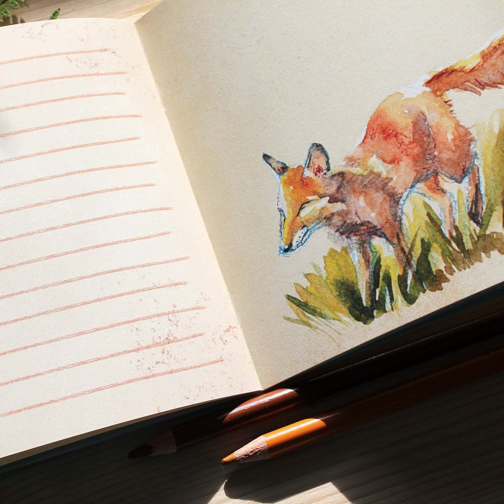
A selection of my finished pages
Mini thumbnails of all finished pages, placed in a layout overview document
Mini layout of thumbnails for an easy overview, to check it all works together
All pages assembled in a multi-page PDF template, then sent to the printers
The final printed journal coverA peek at an Autumn pageThe final printed journal
Tips / Notes to Self
// A thumbnail overview is useful~ Even a ‘blank’ journal has a sequential layout that requires pacing. A zoomed-out overview lets you check out that colour-schemes and page layouts all have room to breath and are varied enough to be interesting. Especially with so many pages (mine has 44); that’s a lot of room for error!
// Leave lots of time for a multi-page project~ Give yourself a roomy deadline. I knew what I wanted for the finished journal from the start, as gardening is also my hobby, but if it had been an unfamiliar subject I’d have needed a way longer planning and research stage. I’m also naturally bad at time-management so I had to have a lot of patience when things took longer than I initially anticipated. On top of that it was also a new document format, being so many pages, in a publishing program that I have barely used. Patience!
// Ask for a proof version if you have time~I DID actually go for a proof this time, and in the end it wasn’t needed. I ended up making no changes. I think this was down to luck though, and the fact I was making up a booklet to my own requirements. If it had been a commission, or anything with any word count at all (I think this journal has maybe 60 words in it, mostly on the back), then I’d definitely double check before approving the full run. These things cost money, especially with the cost of paper these days, and it’s just not worth throwing your money away. Enquire with your printers, if your print run is large enough then they may be willing to throw in a physical proof print for free.
This journal was certainly a challenge, and if you’re thinking of making up your first illustrated book I’d definitely recommend starting with a familiar subject matter as an anchor to grow your skills around.
If you have any questions, or there’s an aspect you’d like further explanation of, then feel free to comment below!
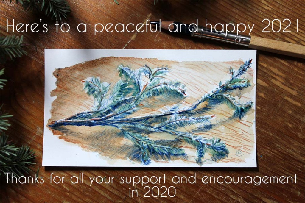
I’m crossing my fingers and toes that this year is a steadier ride for everyone than the last.
My business couldn’t have made it through 2020 without the amazing support and encouragement from you, so a big thanks to everyone who bought anything, pledged to my Patreon (Patrons are superstars: without them I’d have thrown in the towel last year for certain), and those who shared, simply ‘liked’ or commented on my stuff on social media. All very important support, thank you. I was able to launch a Patreon page, invest and test new products, invest in a new graphics programme (Affinity Designer) to streamline my work, and even take a bit of time to dabble in some personal sketches. I feel like I could get my business affairs a bit more in order, finally!
I’m also here to mention that I also have plans for this year. How fast I can roll them out depends on what happens with the latest lockdown, and when my son can go back to childcare, and also my therapy schedule. I think we’ve all learnt to be a bit more flexible over the last year though, so I’m sure I can re-jig and fit most of my plans in if needs be.
I have a few new products sat here waiting to be assembled, photographed and listed, which I’m already proud of even if no-one else is interested in them. I already plan to use some of them myself.
On the ‘sustainability’ front I’m also dipping my toes in with a local supplier who hold themselves accountable when it comes to the environment. I’ll be trying new cards and textile products this month, actually.
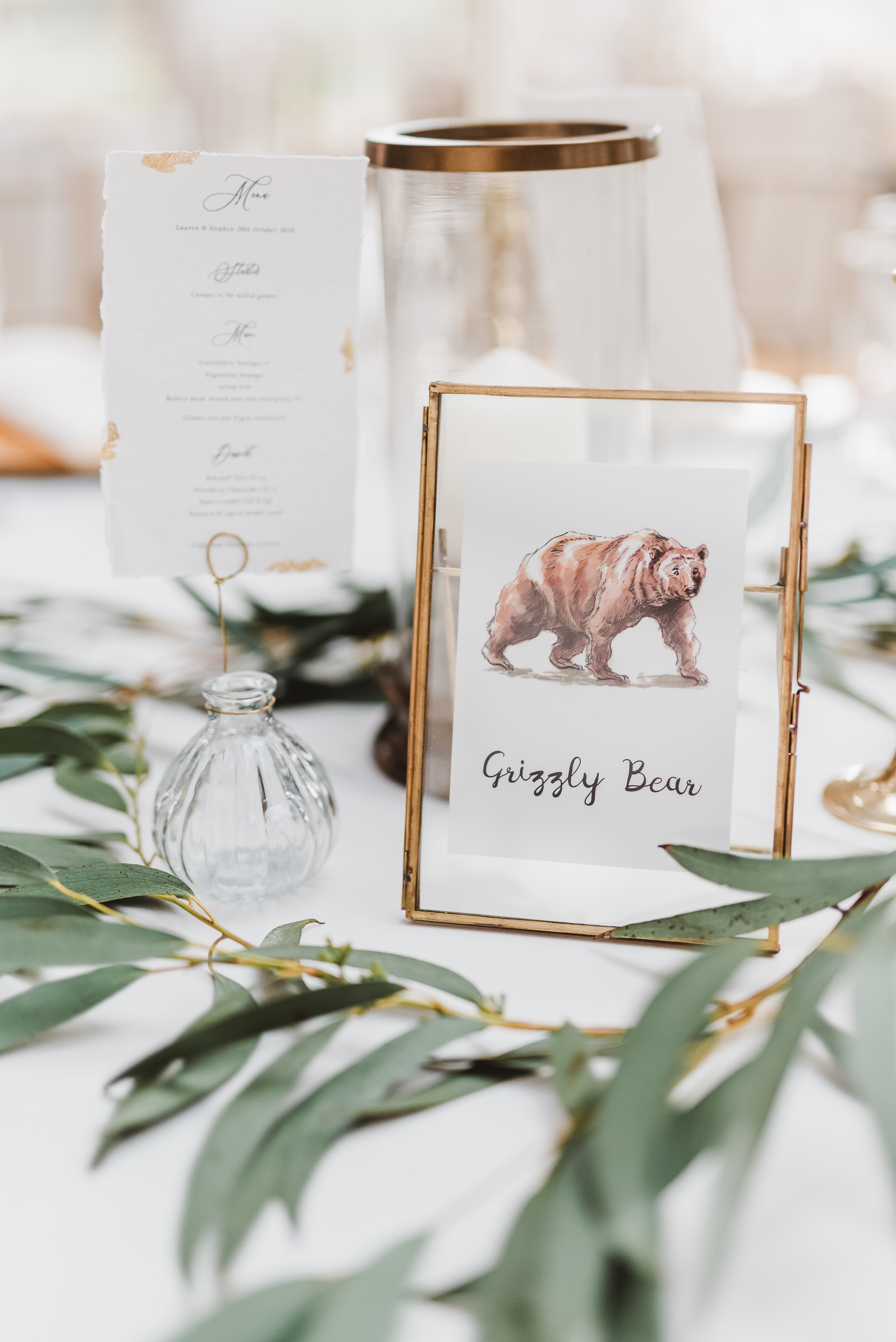
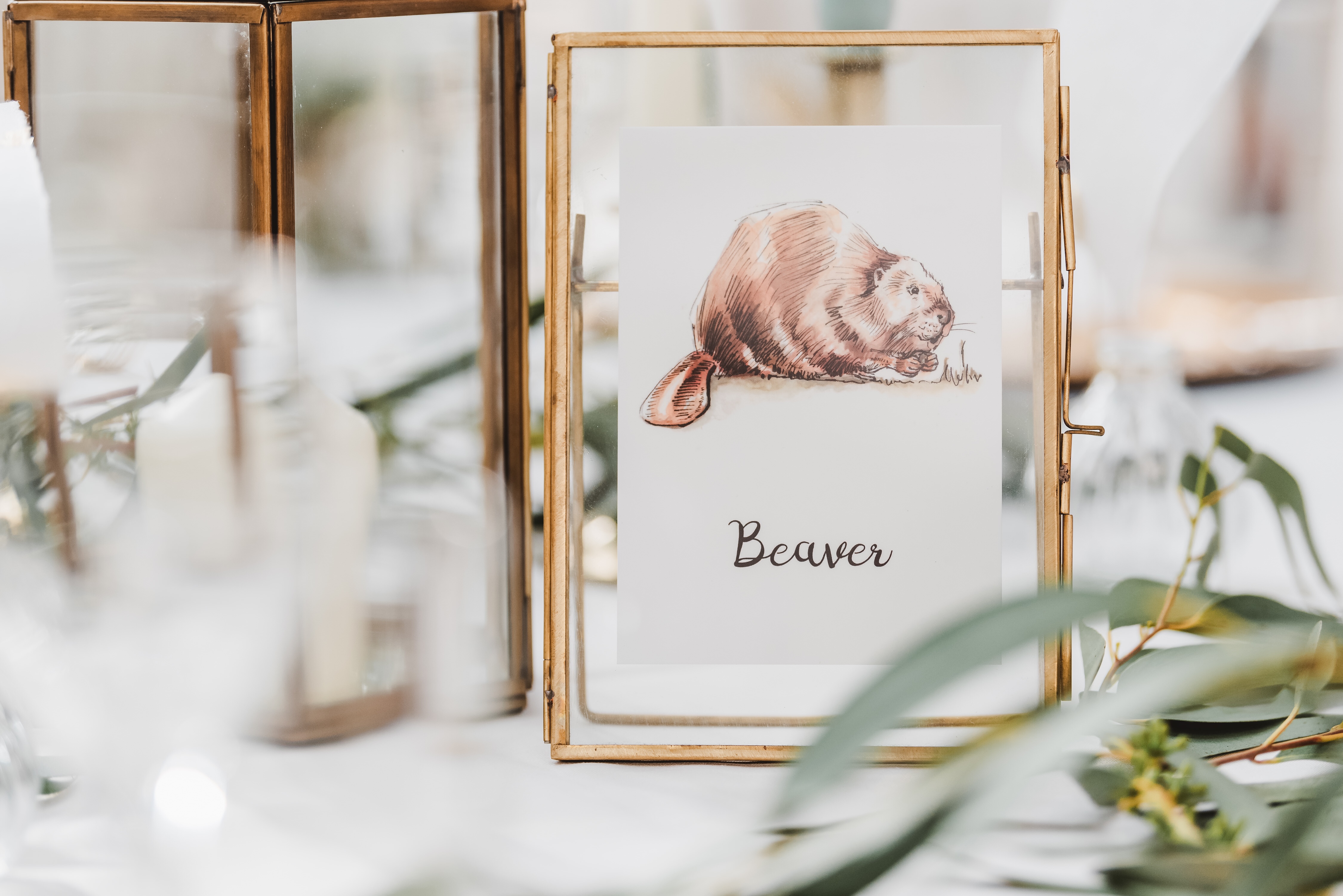
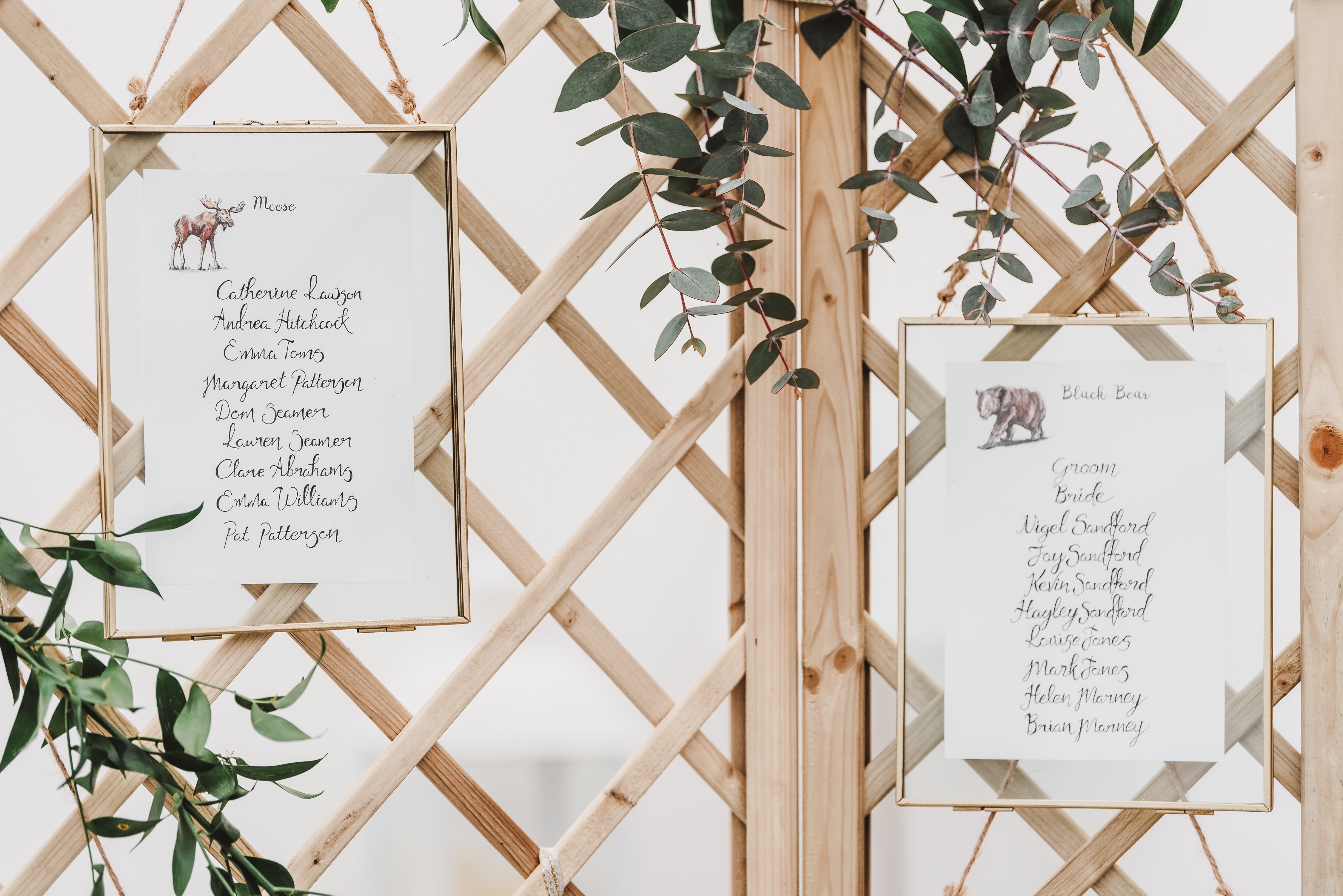
Sometimes custom projects come along that are so satisfying to work on from start to finish. Lauren and Stephen very kindly asked me for some illustrated North American animals for their wedding, which they then worked into their table names and seating plans.
The results were a mix of brush pen and ink, plus watercolours. Simple, quick and loose (read: fun to do!) but still cohesive as a set. This was the first time I’d done a series in a while, but I think it gelled well.
Illustrations printed and ready to ship
I was happy with my drawings once I’d passed them on, but boy did they come together with the gorgeous styling of the wedding! The photography by Georgi Mabee also showcased the event to stunning effect, so thank you to her for letting show off my illustrations with her photos.
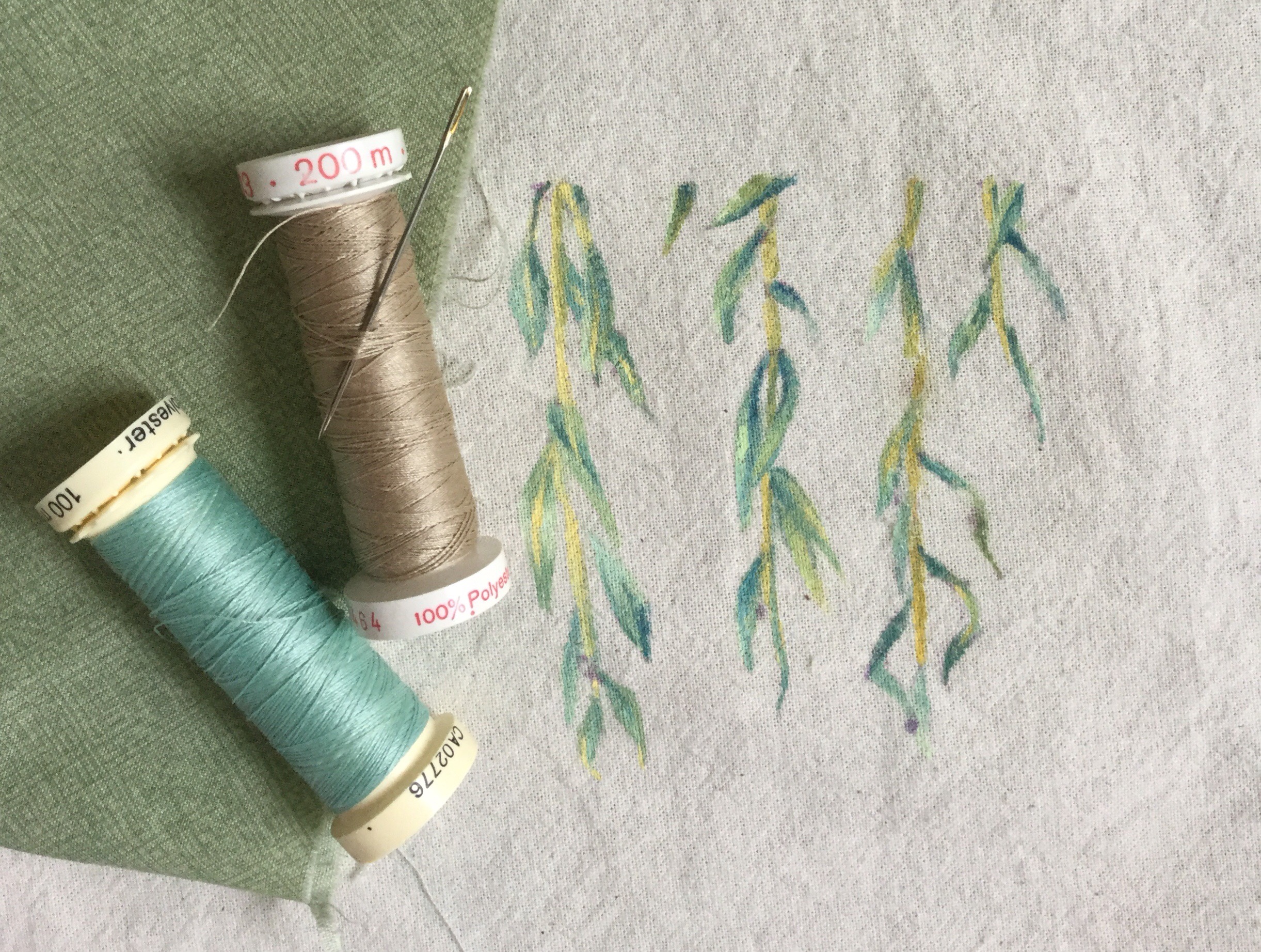
You may notice when you look at my art that it is often quite muted and earthy in colours, and that is a by-product of the materials I choose to use. I love bright colours in my personal life, but for my work I’ve chosen to go with a more muted colour palette, as it’s often better for myself, others and the environment. I prefer to keep my sustainable footprint as small as possible by working with found, recycled/rescued or upcycled materials where I can, and in particular ones that were made with as few harmful dyes as possible.
Of course, sometimes nature provides a way of working that gives spectularly pure colours (I’m looking at you, indigo), and some of the materials I’ve used happen to have been bright pops of colour, such as the off-cuts of industrial faux-leather I’ve used in my bags in the past. More often though the less harmful dyes are of course, more earthy. I have used un-bleached cotton and linen in things like my zipped pouches (I’m working on a new range!), which instead of bright white gives a lovely warm beige. Paper from recycled pulp is also often of mixed fibres, resulting in natural melange of soft colours. I also love working with recycled paper for my lino prints and the handmade cards.
Unbleached cotton for one of my hand-painted zip pouches
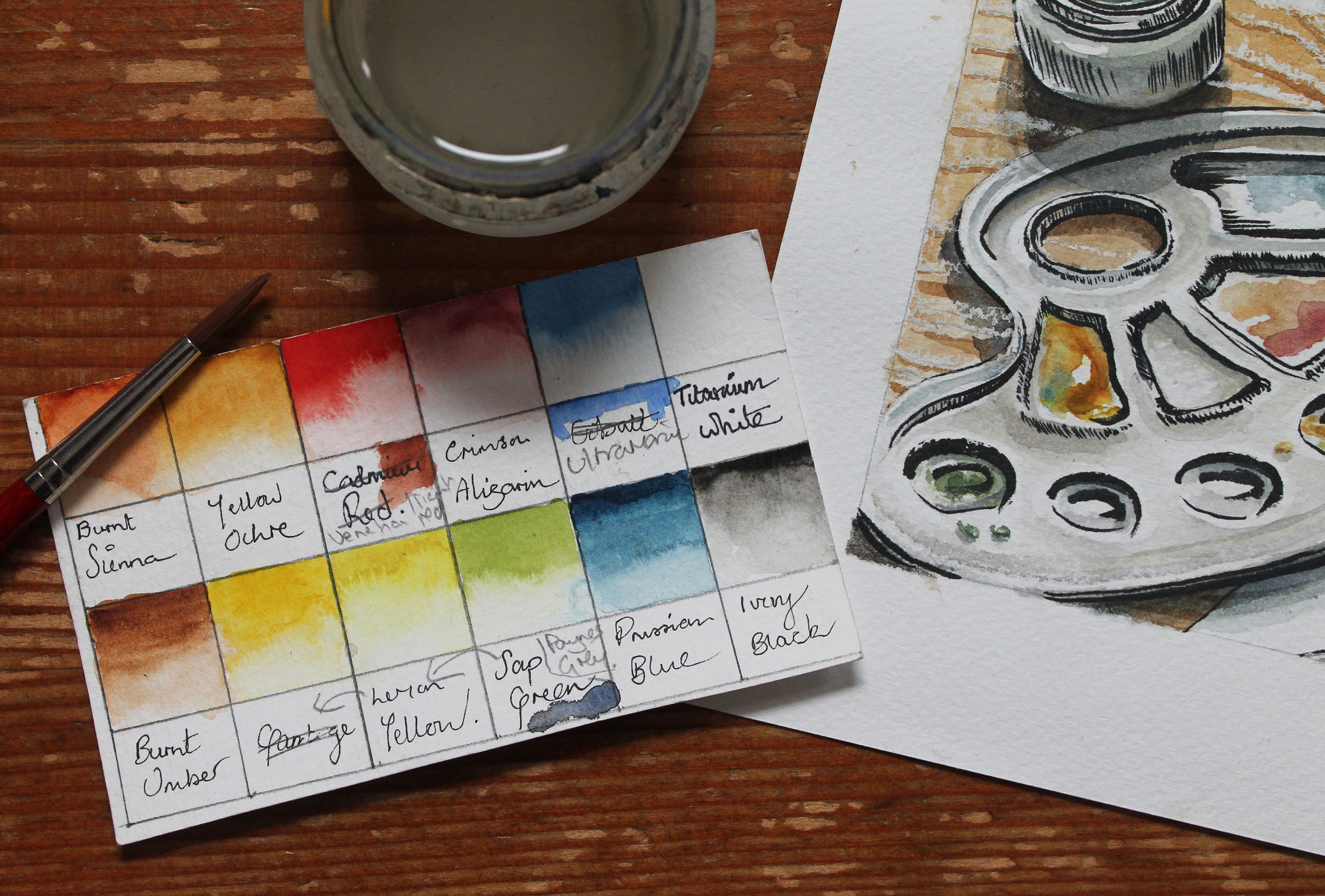
My pregnancy this year spurred me to make a change to my watercolour paint palette too. After a bit of research I am happy to have found what seems to be quite a varied palette with some rich colours, which is still less toxic to Baby Q and myself. Out went the obvious Cadmium hues and a few of the ‘older’ pigments (they’ve developed safer ones now). You can see a few changes I made in my swatch below. Scribbles look super professional, I know.
My adjusted palette swatches.
It’s not perfectly safe, but at least I’ve chucked out some of the scarier ones. No Vermilion-induced birth defects for us (it contains mercury)! I’d love to hear from you if you know any good resources for checking what are ‘safe’, or relatively safe pigments.
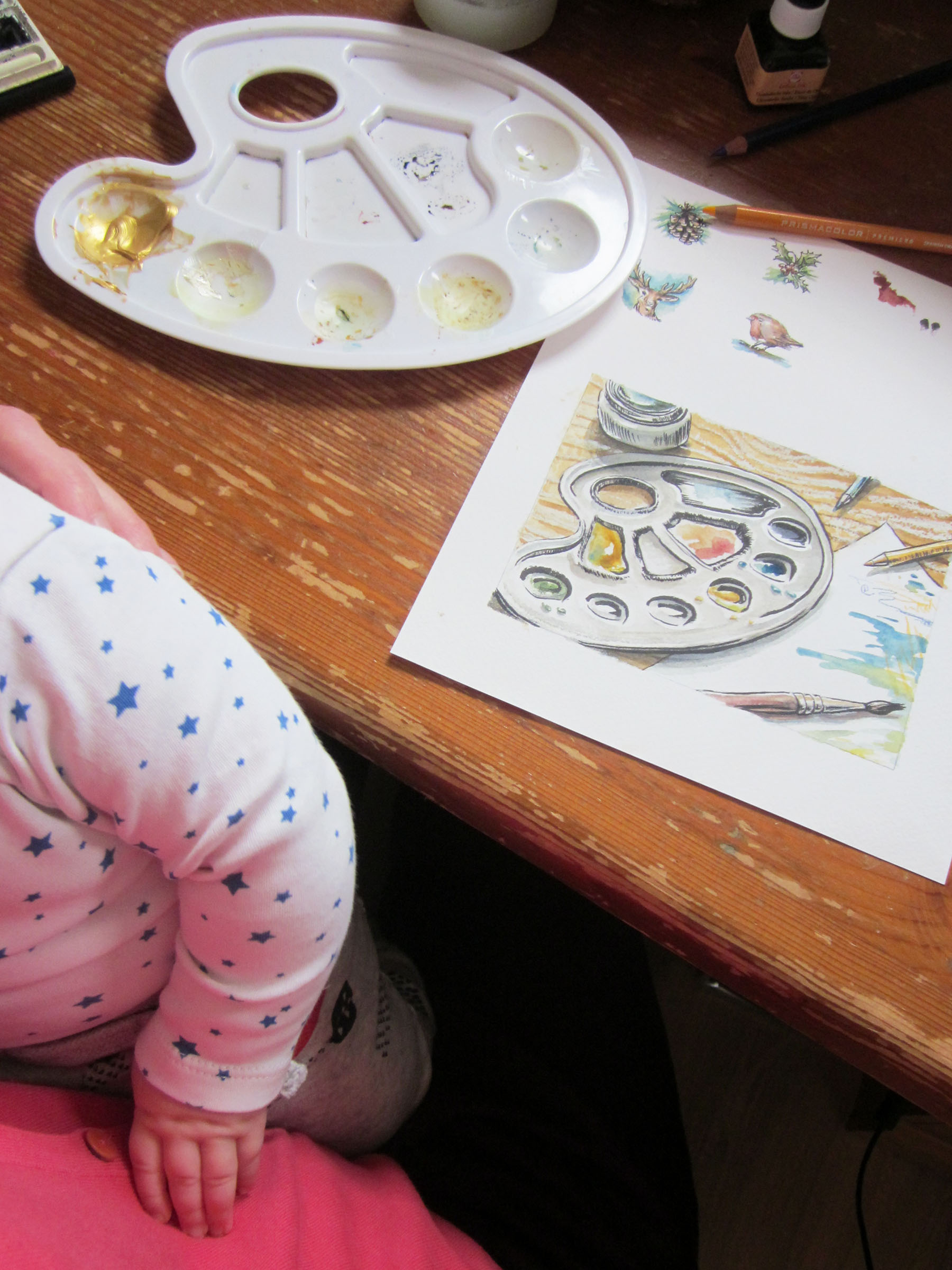
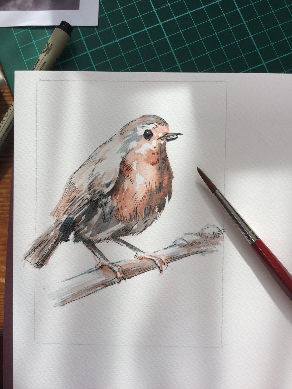
Here’s a recent painting I did for this year’s Christmas cards (the robin one was a very limited run… it’s sold out!)-
My biggest bug-bear is that I miss a bright red. The other hues in my core palette are very lovely, as is Indian Red (or Light Red, as named by some brands), which is the red I’m currently using. You can see the swatch tucked under where I’ve crossed out ‘Cadmium Red’, which I’ve stopped using. Light Red just misses that… pizazz that Cadmium has, and tends to muddy other colours when mixed. Light/Indian Red also varies from brand to brand. So again if anyone knows of any brighter, relatively safe reds, please let me know!
In the last couple of months I’ve found that if I can work, I MUST work, for my sanity!
A series of one of my favourite subjects, doors and windows, has been the result of some snatched sketches and painting. The reference photos were taken by me over a couple of years with the theme in mind, so I have a couple of good ‘uns. I’m just finishing up the last one this week, and am pretty pleased with the paintings and also noticed an improvement in my technique. I was certainly quicker, after painting all those bricks and sandstones! Once it’s wrapped up I’ll clean them up and have a limited amount of 2019 calendars made, so do let me know if you’d like one reserved.
Here’s a quick glimpse of a couple (you can see more on my Instagram @illustratorlaura )-
It’s been very quiet around here, but I’ve been busy. We welcomed our little baby boy, Baby Q, in July!
A common scene at my desk
Over a few months of adjustment I’ve managed to sneak in some illustration work time, and you can see what I’ve been up to over on my Instagram @illustratorlaura.
It’s been tough, having to work around the schedule of a completely new human, who has no clue what a schedule even is. I’m constantly tired, and you can throw any expectation of plans right out the window. Any work is nibbled at in tiny ten minute bites, mostly with an ear out whilst I hold my breath and hope the wee man doesn’t wake up. Luckily there are a couple of hours of babysitting time a week, which is heaven. And yeah: mini human. Super cute.
Having so little ‘me’ time has made me realise that illustrating is such a necessary part of my life, and it’s renewed my drive to fit it in, no matter how drained I feel. I’ve been working on a new series, which you can get a peak at over on Instagram (and I’ll share here shortly).
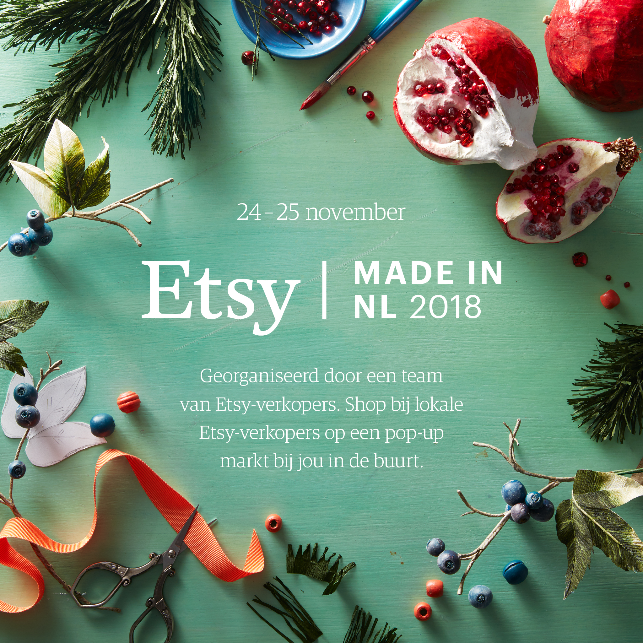
I’m also a bit nervous about this but I’m doing it anyway: another market! It’s been a couple of years since I was doing them regularly, and it’s a bit of pressure to prepare for it at such a busy time. Markets are always fun though, great to get yourself and your work out there, and I do love a challenge.
If you’re in the Eindhoven area on the weekend 24/25th November (I’ll only be there Sunday 25th) get yourself down to Etsy Made in Eindhoven pop-up market and show some love for local makers and sellers!
I’m back in ‘work mode’ after the holidays, finally.
Can’t wait to get stuck in with my ongoing and new creative projects, I’ve so many plans!
I’m trying to share my work more with the world this year, so that people can see what it is I actually do! Some projects are too personal to share, or I can’t share them yet, but here are a few pet portraits I was lucky enough to be commissioned for before Christmas-
Cat portrait, Laura Carter Illustration
watercolour WIP, Laura Carter Illustration
Puppy plaque, illustratorlaura
Dog portrait, Laura Carter Illustration
All watercolour, and the little wooden plaque was gouache.
Do contact me if you’d like me to do something personal for you, human or furbaby!


")
")