‘Biblioscapes’~ An Illustrated Journey Through Literary Landscapes

Art, illustration, product development
The ‘flavour’ page for the Biblioscapes project

I’m rounding up the first leg of what will hopefully be an expansive project for me, as it has so much life in it and covers some of my favourite loves: books, vintage ephemera, environments and the wonderful worlds we find ourselves in when we read. Here’s a look at some of the process…

The 2024 Biblioscapes wall calendar is about to become available to order (my newsletter will keep you updated!), and my favourite six of the illustrations will be released as prints and postcards in the shop.

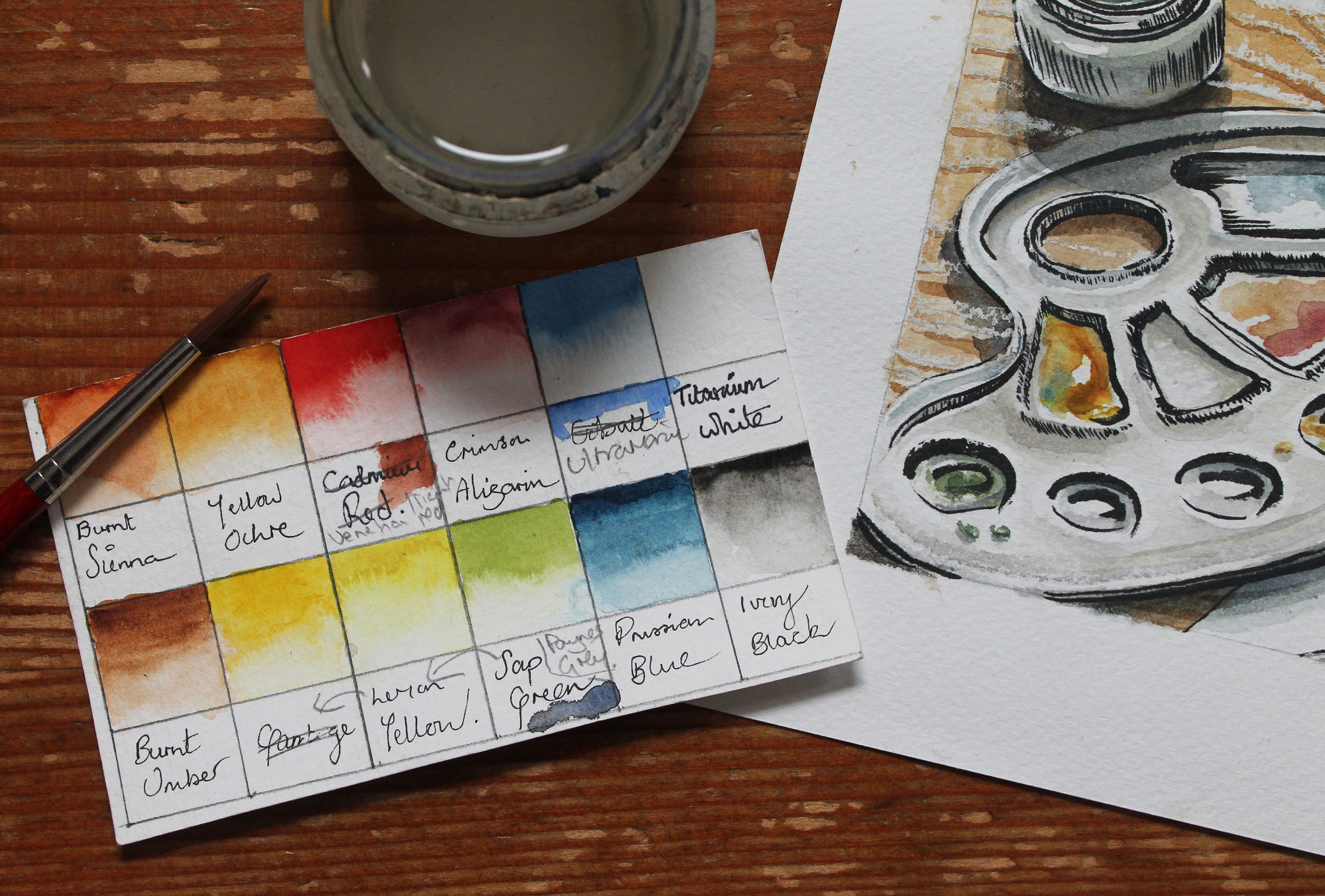
I’ve looked at so much reference from vintage travel ephemera, maps, and guides that I was stumped with what not to include, and had a terrible time keeping the design simple.

The first video showing my first research stage is here, the development for the watercolour landscapes is here, and you can see more development here.

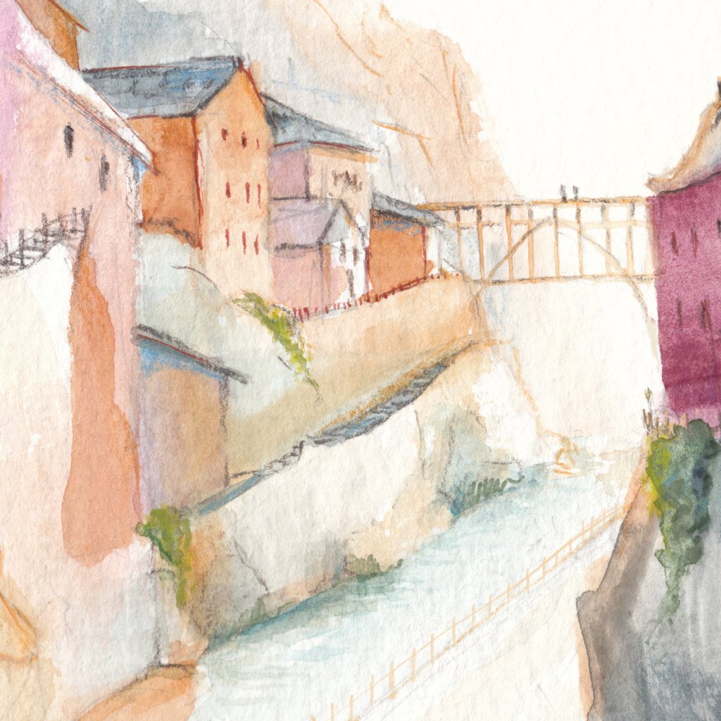
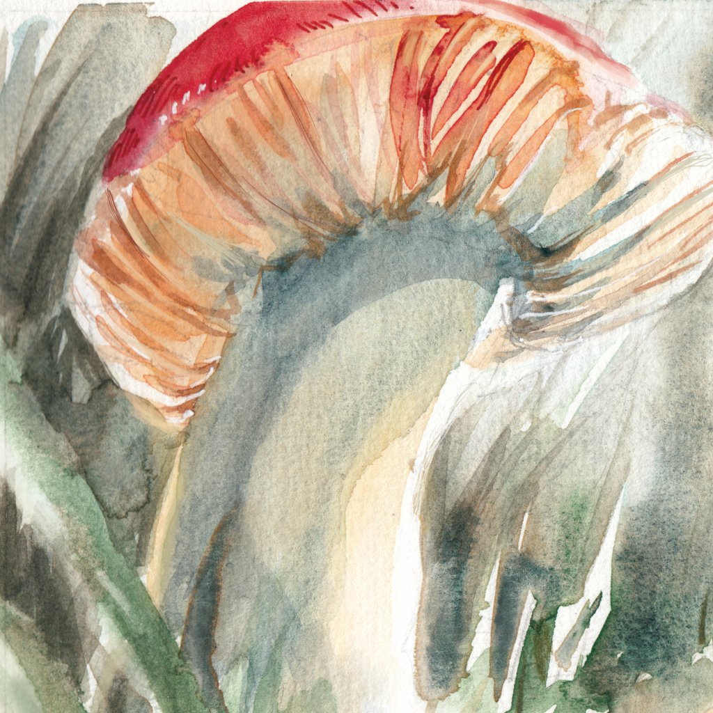
The actual illustrations were pretty straightforward, as some of these places have lived in my head for years, originating of course in stories and the works of others. I’m sure you can all relate to some of the locations and might be able to ‘place’ a book it might belong to. Using my experience of illustrating the natural world the scenes were fairly easy to realise, though I’ve never painted a ‘galaxy’ scene before.

I found portraying ‘tourists and locals’ from each scene more challenging. I didn’t want to go in to the minutiae of the world too much, as so much of this is done in your own head whilst reading. I kept the canvas fairly sparse for the viewers imagination to populate. I’ve even played with the scale, as just with dreams, a literary world can become larger than life.

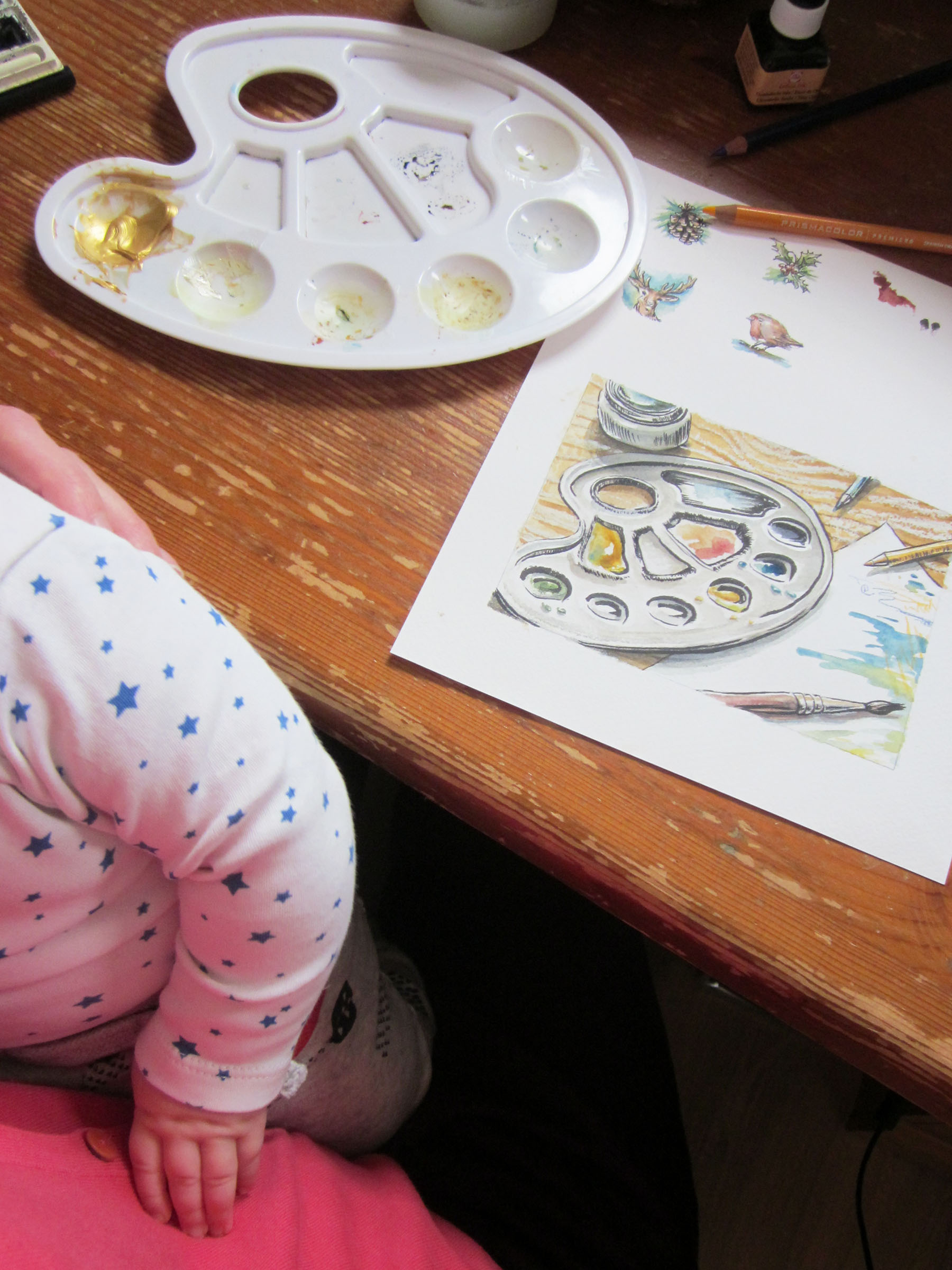
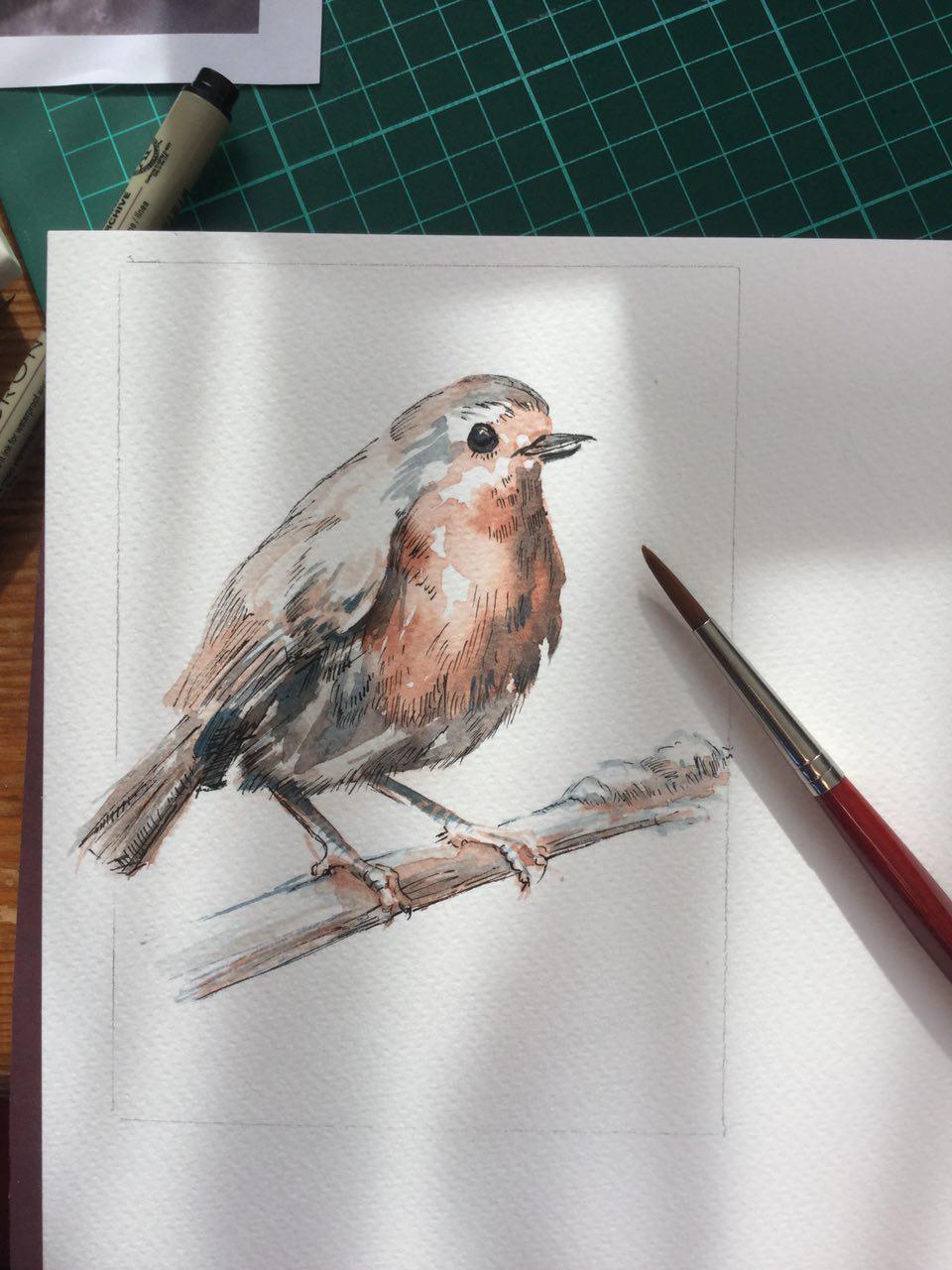
I developed the figures last, as a way to avoid adding too much detail. Here’s the process-

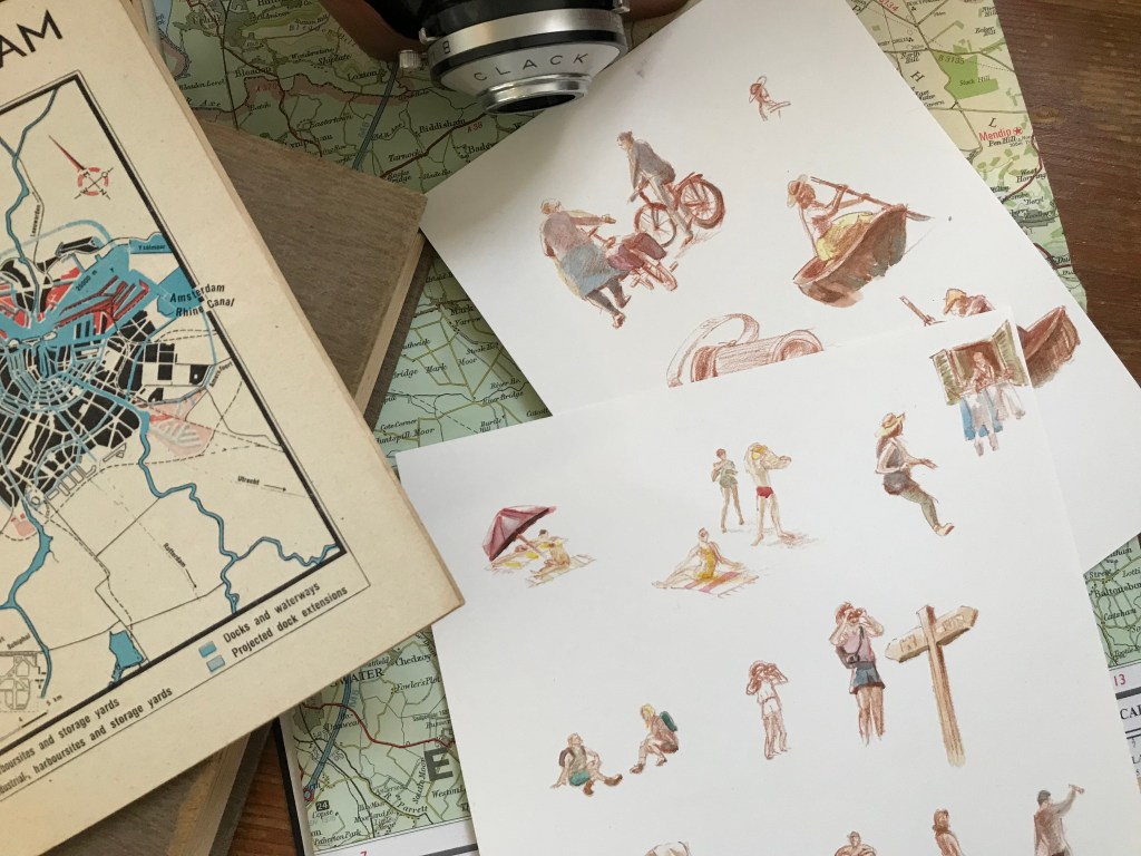
I had to go and do a bit of urban sketching first to observe what sort of details are visible from a distance, as they would be quite a small scale compared to the size of the environments. Facial features disappear, and it becomes largely about silhouette and tone. I did laugh to myself drawing the characters! Tourists have a special something, don’t they? They were mostly worked from photos and my imagination. It’s been ages since I went to life drawing so it was quite tough.

As a trained illustrator and a life-long lover of books (my job working in a bookshop was often a dream come true!) this project has been a wonderful challenge. I hope you enjoy viewing it as much as I did making it. The final illustrations will be found in the ‘Illustrations’ section of my Portfolio, once the calendar is available for sale.

There are so many more ‘genres’ of literary landscape I’d love to capture on paper, who know how extensive this series will become!

L x

Watercolour Workshop at the Blokhut~ Winter Botanicals edition

Art, Creative life, eindhoven, events, expat life, indie business, Markets and events, product development

Come join us Saturday 10th Dec at the Blokhut for a ‘Winter Botanicals’ watercolor workshop! All abilities welcome, I can give tips for those who ask, or just come along and do your thing. Botanics are one of my passions and a much-covered subject in my work. I’d love to share my process with you!

We’ll have some lovely botanical materials on the table to paint and draw from (donation jar will be on the table, much appreciated!), or bring your own ‘wintery’ reference photos.

Come join us on the 10th for a watercolor workshop in Eindhoven!

We speak both Dutch and English. Everyone is welcome!

Use our watercolour materials (10 sets available, first come first served) to make a couple of paintings, or bring your own painting equipment. Materials for tonal sketching will also be available.

This will be inside, so no worries about the weather. This will be our third edition, and the first two were really fun, with some good chats with fellow creatives.

PLEASE NOTE~ Please sign up to the Facebook event or send me a message to say you plan on coming if possible, so that I can make sure we have a decent amount of reference material laid out for everyone. It helps me out greatly with planning!

Here are some examples of the type of botanical illustrations I can show the process for in the workshop, if you want to follow along~

For the second image I used my painting as the background for a mini desk calendar, which is available to my peeps on Patreon (hence the smaller image size: it’s exclusively for the use of my Patrons).

Here’s a peek into my process~

Tutorial video for watercolor painting workshop in Eindhoven, December

Creating little spot images like these are a great way to make art for yourself, for journaling, to stick on your wall or to turn in to your Christmas cards this year. You’ll come away with something you love!

Hope to see you there!

Laura

Watercolour Painting Workshop in Eindhoven

Art, Creative life, eindhoven, events, expat life

We’re back for another painting workshop at the Blokhut in Eindhoven, after the success of the first one! Saturday 24th September 10.00-12.00 with the theme ‘Late-Summer Botanicals’.

This one will be an actual lesson with tips and guidance on how I paint my botanical sketches in watercolours. Again suitable for both beginners and advanced watercolourists (in which case, feel free to do your own technique and just enjoy the company and creativity), all are welcome. We speak both English and Dutch.

Painting lesson Eindhoven 24th September

We have 10 sets of materials available for use, so get there quick to grab one. First come, first served. Coffee and tea available. Come on down for a casual creative morning.

It’s a free session, but donations for materials will be greatly appreciated. I’ll bring a tip jar ❤

Our painting session is back on request!

Hope to see you there!
Laura

Yksi Expo EHV- Sustainable Design

Art, Creative life, illustration, Sustainable design, Uncategorized

Me and the fam took a little trip to Yksi Expo, situated in Strijp, Eindhoven. It focuses on circular and sustainable design.

Seeing as sustainable design is a passion of mine in my daily life, and an aim in my business one, I’ve been interested in seeing this space. It’s worth a visit if you’re down in Strijp S.

There is also a lovely little shop (full of sustainable and zero-waste products of course), and a little cafe called Tea Stories. BTW they sell really good gluten-free (and I noticed also vegan) chocolate cake!

We stocked up on lentils in our re-usable organza bag. You can bulk-buy pasta and other dried goods here.

If you want to get involved in the circular design/zero waste scene in Eindhoven, they are holding an end-of-summer party on Aug 31st. You can contact them here to find out more and get tickets.

Strijp itself is a good location for sketching, though I don’t get out there as often as I’d like to do that. Managed to do a quick little one, with my little one, baby Q, in tow.

I’m planning some more products with upcycled fabrics, which is a good way to cut waste. I’ll keep you updated!

Laura

My Choice to use an Earthy Palette

Art, Creative life, Uncategorized

You may notice when you look at my art that it is often quite muted and earthy in colours, and that is a by-product of the materials I choose to use. I love bright colours in my personal life, but for my work I’ve chosen to go with a more muted colour palette, as it’s often better for myself, others and the environment. I prefer to keep my sustainable footprint as small as possible by working with found, recycled/rescued or upcycled materials where I can, and in particular ones that were made with as few harmful dyes as possible.

Of course, sometimes nature provides a way of working that gives spectularly pure colours (I’m looking at you, indigo), and some of the materials I’ve used happen to have been bright pops of colour, such as the off-cuts of industrial faux-leather I’ve used in my bags in the past.  More often though the less harmful dyes are of course, more earthy. I have used un-bleached cotton  and linen in things like my zipped pouches (I’m working on a new range!), which instead of bright white gives a lovely warm beige. Paper from recycled pulp is also often of mixed fibres, resulting in natural melange of soft colours.  I also love working with recycled paper for my lino prints and the handmade cards.

ACS_0007

Unbleached cotton for one of my hand-painted zip pouches

My pregnancy this year spurred me to make a change to my watercolour paint palette too. After a bit of research I am happy to have found what seems to be quite a varied palette with some rich colours, which is still less toxic to Baby Q and myself. Out went the obvious Cadmium hues and a few of the ‘older’ pigments (they’ve developed safer ones now). You can see a few changes I made in my swatch below. Scribbles look super professional, I know.

baby changes post 1.JPG

My adjusted palette swatches.

It’s not perfectly safe, but at least I’ve chucked out some of the scarier ones. No Vermilion-induced birth defects for us (it contains mercury)! I’d love to hear from you if you know any good resources for checking what are ‘safe’, or relatively safe pigments.

Here’s a recent painting I did for this year’s Christmas cards (the robin one was a very limited run… it’s sold out!)-

laura carter illustration robin

My biggest bug-bear is that I miss a bright red. The other hues in my core palette are very lovely, as is Indian Red (or Light Red, as named by some brands), which is the red I’m currently using. You can see the swatch tucked under where I’ve crossed out ‘Cadmium Red’, which I’ve stopped using. Light Red just misses that… pizazz that Cadmium has, and tends to muddy other colours when mixed. Light/Indian Red also varies from brand to brand. So again if anyone knows of any brighter, relatively safe reds, please let me know!

New work

Art, illustration, Uncategorized

In the last couple of months I’ve found that if I can work, I MUST work, for my sanity!

A series of one of my favourite subjects, doors and windows, has been the result of some snatched sketches and painting. The reference photos were taken by me over a couple of years with the theme in mind, so I have a couple of good ‘uns. I’m just finishing up the last one this week, and am pretty pleased with the paintings and also noticed an improvement in my technique. I was certainly quicker, after painting all those bricks and sandstones! Once it’s wrapped up I’ll clean them up and have a limited amount of 2019 calendars made, so do let me know if you’d like one reserved.

Here’s a quick glimpse of a couple (you can see more on my Instagram @illustratorlaura )-


Small Steps

Creative life, Uncategorized

It’s been very quiet around here, but I’ve been busy. We welcomed our little baby boy, Baby Q, in July!

baby changes post

A common scene at my desk

Over a few months of adjustment I’ve managed to sneak in some illustration work time, and you can see what I’ve been up to over on my Instagram @illustratorlaura.

It’s been tough, having to work around the schedule of a completely new human, who has no clue what a schedule even is. I’m constantly tired, and you can throw any expectation of plans right out the window. Any work is nibbled at in tiny ten minute bites, mostly with an ear out whilst I hold my breath and hope the wee man doesn’t wake up. Luckily there are a couple of hours of babysitting time a week, which is heaven. And yeah: mini human. Super cute.

Having so little ‘me’ time has made me realise that illustrating is such a necessary part of my life, and it’s renewed my drive to fit it in, no matter how drained I feel. I’ve been working on a new series, which you can get a peak at over on Instagram (and I’ll share here shortly).

I’m also a bit nervous about this but I’m doing it anyway: another market! It’s been a couple of years since I was doing them regularly, and it’s a bit of pressure to prepare for it at such a busy time. Markets are always fun though, great to get yourself and your work out there, and I do love a challenge.

If you’re in the Eindhoven area on the weekend 24/25th November (I’ll only be there Sunday 25th) get yourself down to Etsy Made in Eindhoven pop-up market and show some love for local makers and sellers!

EML-NL-Instagram-Static


Home linocut: Part 1

Art, illustration

This is my first linocut in 10 years. The last one I made was at university, in a lovely print studio with a beautiful big press. I recently got into stamp carving, and thought I’d try to up my game a bit with some lino and a small handmade press I made myself (really a glorified flower press). Using a strawberry plant on my balcony as inspiration, I cut a small block to test the best setup.

I vaguely remembered lino cutting being painful, and needing to keep plasters close at hand. So I built myself a bench block, which helped a lot and actually (for the record) I DIDN’T CUT MYSELF ONCE. What.

Then I had so many variations on materials that I wanted to experiment with. I ended up dabbling around with two basic black inks: Akua Intaglio and Daler Rowney Water-Soluble block printing colour. I found barely any visible difference between the resulting prints, but preferred the more velvety texture of the Akua ink whilst working with it. Both are water-soluble and make for a quick and tidy clean-up, with no harsh chemicals that oil-based inks need.

I did the whole session on a big glass plate, occasionally putting the press on the floor to kneel on it so I could tighten the wing nuts, which worked a treat. Definitely an improvement on the low-pressure ”baren” technique. You can see from the photos that I still had issues with the paper creasing around the corners of the block, which I attribute to uneven application of pressure (I pressed too hard at the corners). I think this was worse on the Fabriano paper. I’d definitely go straight to the 100% cotton rag again; the 50% cotton Fabriano paper just gave more problems overall. It just didn’t seem to pick up the ink as well, though I did like the starker contrast between the white paper and black ink. The price difference between the two papers is worth it.

I then wanted to add colour, and kept it simple with green watercolour and red Prismacolor pencil (the red watercolour wasn’t as vibrant as I wanted). Both worked well with the ink and paper.


I’m pretty happy with the results. Of course there’s a long way to go until I’ve nailed a reliable setup and printing process, but I’m already happy enough to have given a couple of these away as gifts. It’s so satisfying to be able to pull multiple originals on my dining table, and I’ll definitely try it again. Small ‘snapshots’ of my balcony garden are something I’ve been wanting to capture for a long time, so I think I’ll be making a series. I’ll update with my progress next time!