A New Focus for my Work

Art, Creative life, eindhoven, expat life, product development

I say new, it isn’t really, I have just had the mental space to sit down and really consider the why’s and the where to’s of my artwork, and what the connecting thread is. Obvious, once you see it.

Anyhow, the botanical touches in this calendar series are a reminder that the beauty and seasons of nature can still touch us in our daily lives. Completing the series is a continuation of my study of ‘the cycles of nature and our connection to it’.

How Did It All Become Clear?

One evening in October I sat quietly on my son’s bed, his head in my lap, stroking his hair in the dark. We do this every night and it’s often the first chance we get to slow down after a busy day. This particular evening I sat and reflected on where I was with my art, where this year had taken me and where I wanted to go with it next year. I was taking a breather after assembling my exhibition for Dutch Design Week, and had already checked off most of my ‘to do’ list for this year.

I realised the chosen theme for our joint exhibition, a sort of ‘catch-all’ each of us was already using as a creative, was a thread I have always had running through my artwork for a long time. The theme ‘Nature Human Nature; exploring the state of our connection to nature as the organic beings we are’ is not exceptionally unusual but one I’m sure many creatives can relate to.

Nature is Magical, but…

Why would anyone want to hear that coming from me? Everyone knows the natural world is wondrous and important, so how am I sharing it in a meaningful way with people? What in particular about the natural world draws me in so I can draw it out?

My connection to nature was so obvious once I looked again at my work, and the theme for the exhibition.

It’s the cycles! The renewal of the seasons and cycles of nature that return and plough on even when shaken and disrupted by us. Just look at some of the works I’ve made in the last couple of years that physically use a ‘cycles/circles of nature’ theme~

My work is a celebration of how grounded the rhythms of nature keep me, even when I’m living in a box apartment that vibrates with the superficial airco of the supermarket below. The symbols in my images are often widely acknowledged cultural representations of the seasons, a testament to the unity with nature many of us rejoice in throughout the years of our lives. The hopeful fresh tones of Spring, the bountiful blooms of Summer, the chilling angularities of Winter: I want to capture and honour it all. I want to portray the marks it makes on our psyches.

My brain has clearly been crying out for me to connect to nature in my current urban setting. I love people but I’m a nature lover and country girl at heart. I miss walks in the woods and fields, and will rekindle that feeling every way I can. What better way than capturing that magical awe and sharing it with others through my artwork? I hope you can feel the energy and feeling of ‘completeness’ that being able to portray it gives me. I just needed to slow down and pause to catch up with myself again.

Folklore, semiotics and cultural references to nature have long been a part of my work, but now I know I need to delve even deeper to grasp hold of that golden connecting thread running through my artmaking journey. If I’m lucky that thread will pass on beyond my reach to be grasped by others who feel the same connection. Others who find my artwork celebrates their own grounding connection to the natural world, that honours their own seasons.

Onwards!

Laura

Watercolour Workshop at the Blokhut~ Winter Botanicals edition

Art, Creative life, eindhoven, events, expat life, indie business, Markets and events, product development

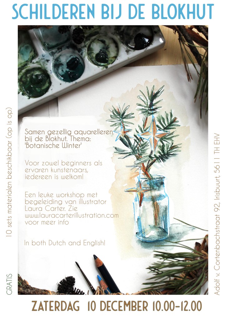
Come join us Saturday 10th Dec at the Blokhut for a ‘Winter Botanicals’ watercolor workshop! All abilities welcome, I can give tips for those who ask, or just come along and do your thing. Botanics are one of my passions and a much-covered subject in my work. I’d love to share my process with you!

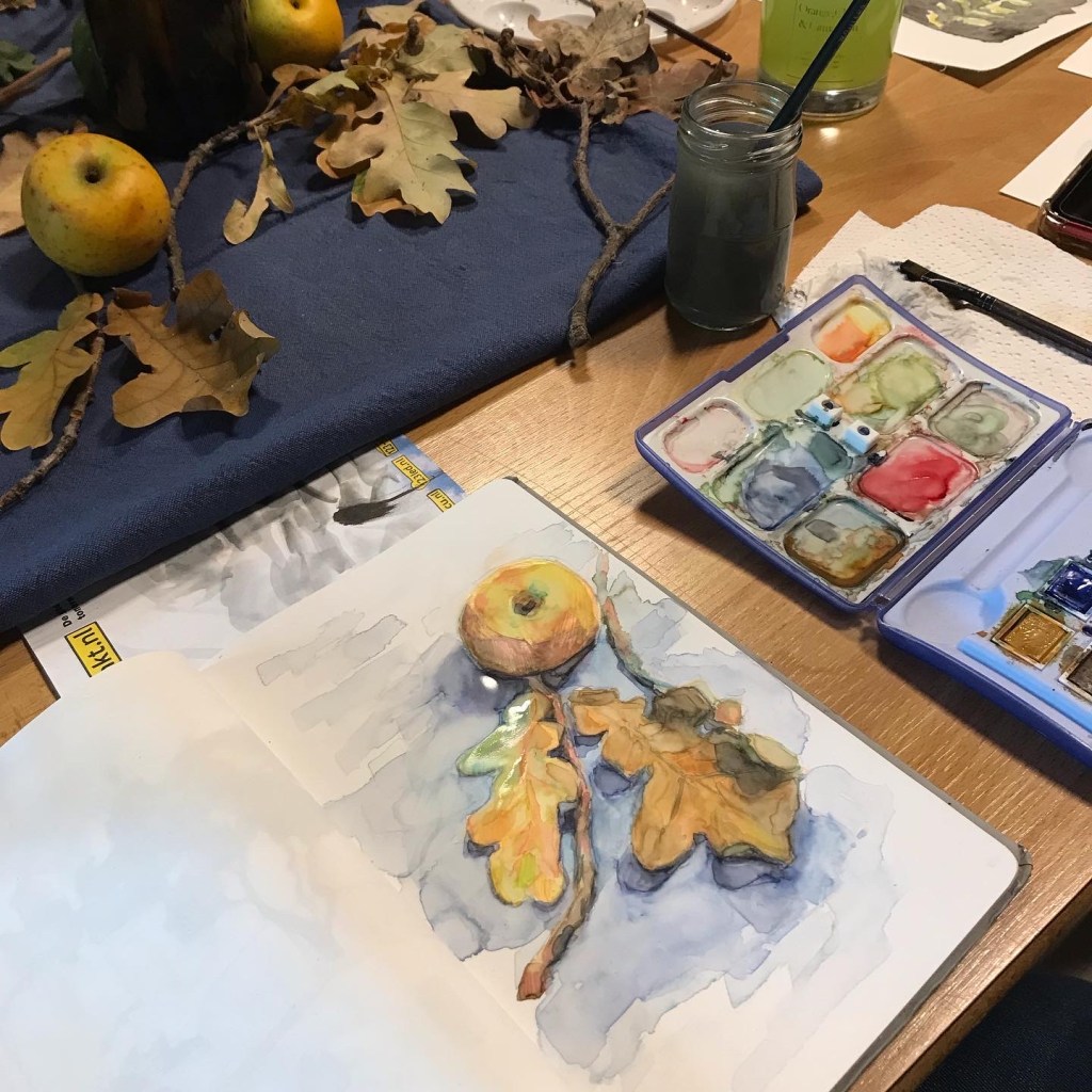
We’ll have some lovely botanical materials on the table to paint and draw from (donation jar will be on the table, much appreciated!), or bring your own ‘wintery’ reference photos.

Come join us on the 10th for a watercolor workshop in Eindhoven!

We speak both Dutch and English. Everyone is welcome!

Use our watercolour materials (10 sets available, first come first served) to make a couple of paintings, or bring your own painting equipment. Materials for tonal sketching will also be available.

This will be inside, so no worries about the weather. This will be our third edition, and the first two were really fun, with some good chats with fellow creatives.

PLEASE NOTE~ Please sign up to the Facebook event or send me a message to say you plan on coming if possible, so that I can make sure we have a decent amount of reference material laid out for everyone. It helps me out greatly with planning!

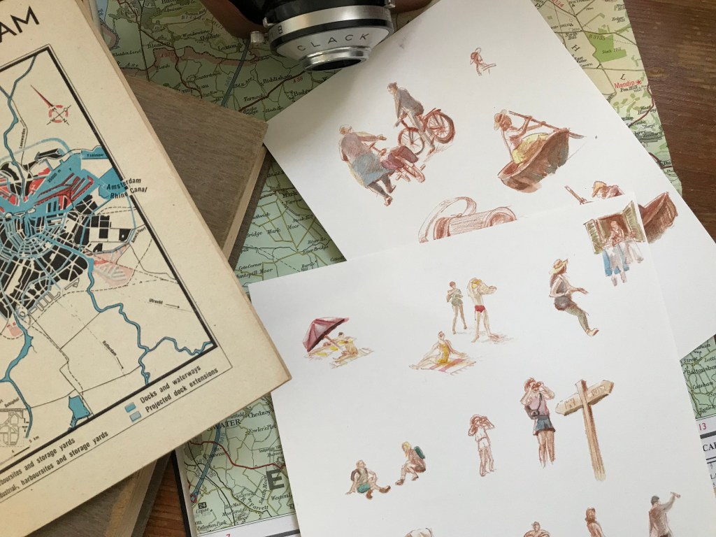
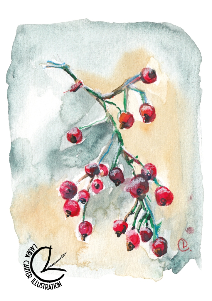
Here are some examples of the type of botanical illustrations I can show the process for in the workshop, if you want to follow along~

For the second image I used my painting as the background for a mini desk calendar, which is available to my peeps on Patreon (hence the smaller image size: it’s exclusively for the use of my Patrons).

Here’s a peek into my process~

Tutorial video for watercolor painting workshop in Eindhoven, December

Creating little spot images like these are a great way to make art for yourself, for journaling, to stick on your wall or to turn in to your Christmas cards this year. You’ll come away with something you love!

Hope to see you there!

Laura

Watercolour Painting Workshop in Eindhoven

Art, Creative life, eindhoven, events, expat life

We’re back for another painting workshop at the Blokhut in Eindhoven, after the success of the first one! Saturday 24th September 10.00-12.00 with the theme ‘Late-Summer Botanicals’.

This one will be an actual lesson with tips and guidance on how I paint my botanical sketches in watercolours. Again suitable for both beginners and advanced watercolourists (in which case, feel free to do your own technique and just enjoy the company and creativity), all are welcome. We speak both English and Dutch.

Painting lesson Eindhoven 24th September

We have 10 sets of materials available for use, so get there quick to grab one. First come, first served. Coffee and tea available. Come on down for a casual creative morning.

It’s a free session, but donations for materials will be greatly appreciated. I’ll bring a tip jar ❤

Our painting session is back on request!

Hope to see you there!
Laura

Back with live watercolour painting sessions in Eindhoven!

eindhoven, events, expat life

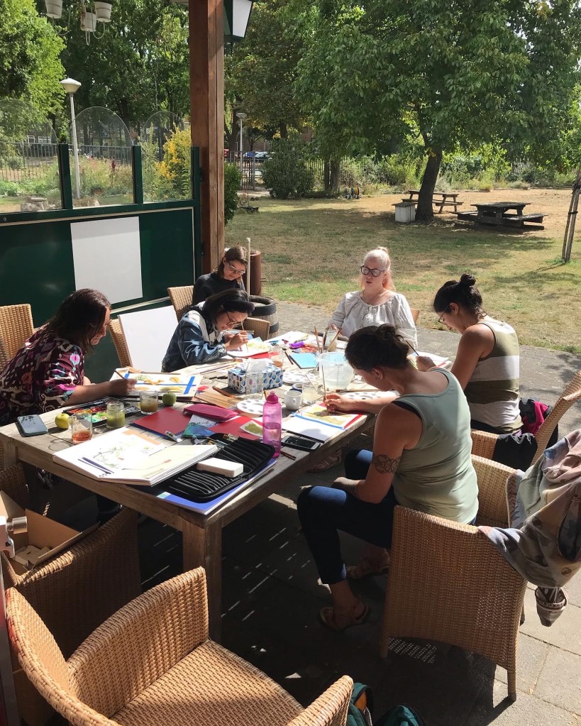
I’m pleased to announce that you can join me for a watercolor painting event in Eindhoven! Myself and a couple of folks thought it a lovely idea to get together for a casual painting session, on location inspired by the lovely Blokhut garden, in the Irisbuurt.

Come join us!

Come join us for a fun painting session in the Irisbuurt Blokhut!

Open for beginners and experienced artists. This will be a casual session with no set instructions to follow, but tips and guidance will be available for beginners and anyone who asks. I speak both Dutch and English. Everyone is welcome!

Use our watercolour materials (10 sets available, first come first served) to make a couple of paintings of the lovely garden, or bring your own painting equipment and inspiration pictures. Materials for tonal sketching will also be available.

We’ll go ahead even if it’s raining, we can sit further under cover and arrange for botanical material on the tables to paint. 

Having missed painting in person with people over the last few years, I’m very much looking forward to this get together!

If you’d like to RSVP to the Facebook event, you can do that here.

See you there!

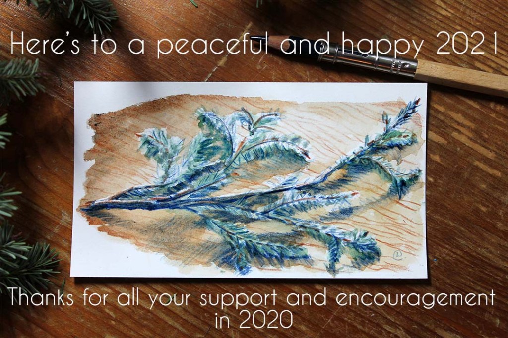
Here’s to a Happy and Healthy 2021!

Creative life, indie business, Sustainable design

I’m crossing my fingers and toes that this year is a steadier ride for everyone than the last.

My business couldn’t have made it through 2020 without the amazing support and encouragement from you, so a big thanks to everyone who bought anything, pledged to my Patreon (Patrons are superstars: without them I’d have thrown in the towel last year for certain), and those who shared, simply ‘liked’ or commented on my stuff on social media. All very important support, thank you. I was able to launch a Patreon page, invest and test new products, invest in a new graphics programme (Affinity Designer) to streamline my work, and even take a bit of time to dabble in some personal sketches. I feel like I could get my business affairs a bit more in order, finally!

I’m also here to mention that I also have plans for this year. How fast I can roll them out depends on what happens with the latest lockdown, and when my son can go back to childcare, and also my therapy schedule. I think we’ve all learnt to be a bit more flexible over the last year though, so I’m sure I can re-jig and fit most of my plans in if needs be.

I have a few new products sat here waiting to be assembled, photographed and listed, which I’m already proud of even if no-one else is interested in them. I already plan to use some of them myself.

On the ‘sustainability’ front I’m also dipping my toes in with a local supplier who hold themselves accountable when it comes to the environment. I’ll be trying new cards and textile products this month, actually.

Stay tuned, and have a good ‘un,

Laura x
Eco paper + Print Sale!

Art, Creative life, illustration, Sustainable design

I’ve always been committed to running my business and making art in the most ‘eco-friendly’ way possible (read more here). ‘Eco-friendly’ is a bit of a blanket term, but I think it’s important for all makers to take in to consideration, no matter what your budget-limitations or what products you make. It’s a tough and on-going challenge, but I beleive even small improvements to processes or materials will help.

One of the recent changes I’ve made is to my paper choice for my prints.

First I tried switching over to recycled, uncoated paper. Still on my beautiful ‘photolitho’ printer the prints were subpar, muted and undefined. Such a disappointment! I had desperately wanted this to be the solution, but I am also committed to producing reproductions that do the originals justice. Another aspect of sustainability that I value is ‘quality’. Better to buy one beautiful, archival print and have it hang for decades, rather than chucking it in the bin after a month. At least in my book.

Biotop v regular fineart print paper

Look at how vibrant the left-hand prints are, on my usual paper! I wouldn’t have been happy selling the prints on the recycled paper, seen on the right. It might have worked for a different style of illustration, or something where a warm muted look was required, but certainly not for these.

After that disappointment I spent ages trying to research quality paper for prints that have at least a nod to decent environmental standards. Let me tell you, that’s very difficult.

At last I settled on Hahnemuhle fine art paper. I was a bit reckless and didn’t even try a sample, just went straight out and bought a whole pack (hello €€€). I’m so glad I did!

The results are gorgeous, vibrant and of decent giclee quality with a watercolour paper texture.


Hahnemuhle were one of the few companies that I came across that have a fairly transparent breakdown of their efforts to be ‘eco-friendly’. You can read more here.

// SALE! //

To mark my success with another step in my ongoing ‘sustainability’ journey I’m running a sale on all prints in my Etsy shop! All prints will have 20% off (discount already applied) running today till 3rd December, yay! I’m making way for all prints going forward to be on the Hahnemuhle paper. My existing prints in the sale are also vibrant and on beautiful heavyweight paper, don’t worry!

I’ve also added my Christmas section goodies into the sale, as I’d like them to find new homes so I can make some more :*


Yksi Expo EHV- Sustainable Design

Art, Creative life, illustration, Sustainable design, Uncategorized

Me and the fam took a little trip to Yksi Expo, situated in Strijp, Eindhoven. It focuses on circular and sustainable design.

Seeing as sustainable design is a passion of mine in my daily life, and an aim in my business one, I’ve been interested in seeing this space. It’s worth a visit if you’re down in Strijp S.

There is also a lovely little shop (full of sustainable and zero-waste products of course), and a little cafe called Tea Stories. BTW they sell really good gluten-free (and I noticed also vegan) chocolate cake!

We stocked up on lentils in our re-usable organza bag. You can bulk-buy pasta and other dried goods here.

If you want to get involved in the circular design/zero waste scene in Eindhoven, they are holding an end-of-summer party on Aug 31st. You can contact them here to find out more and get tickets.

Strijp itself is a good location for sketching, though I don’t get out there as often as I’d like to do that. Managed to do a quick little one, with my little one, baby Q, in tow.

I’m planning some more products with upcycled fabrics, which is a good way to cut waste. I’ll keep you updated!

Laura

Custom wedding illustrations

Art, custom illustration, illustration

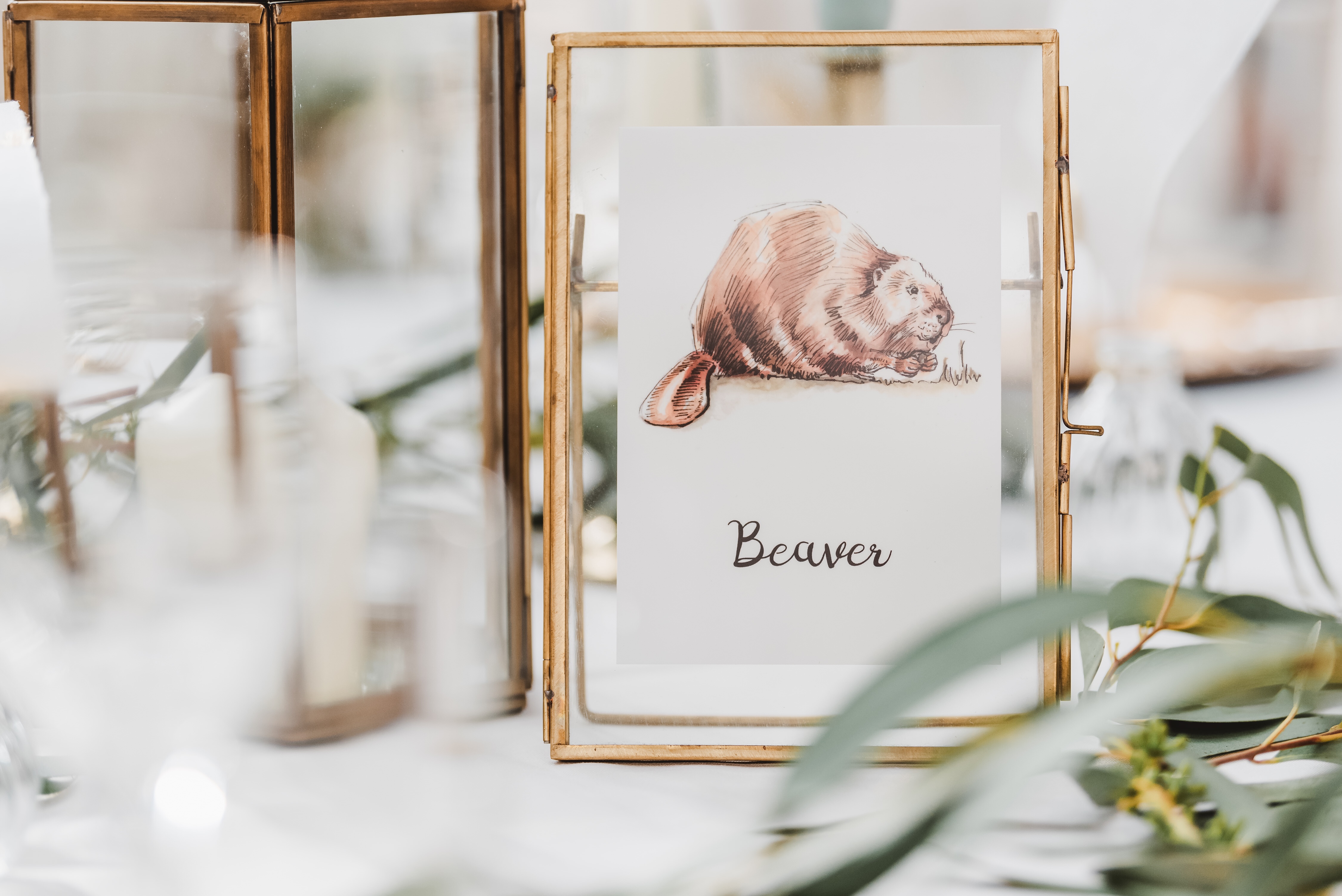
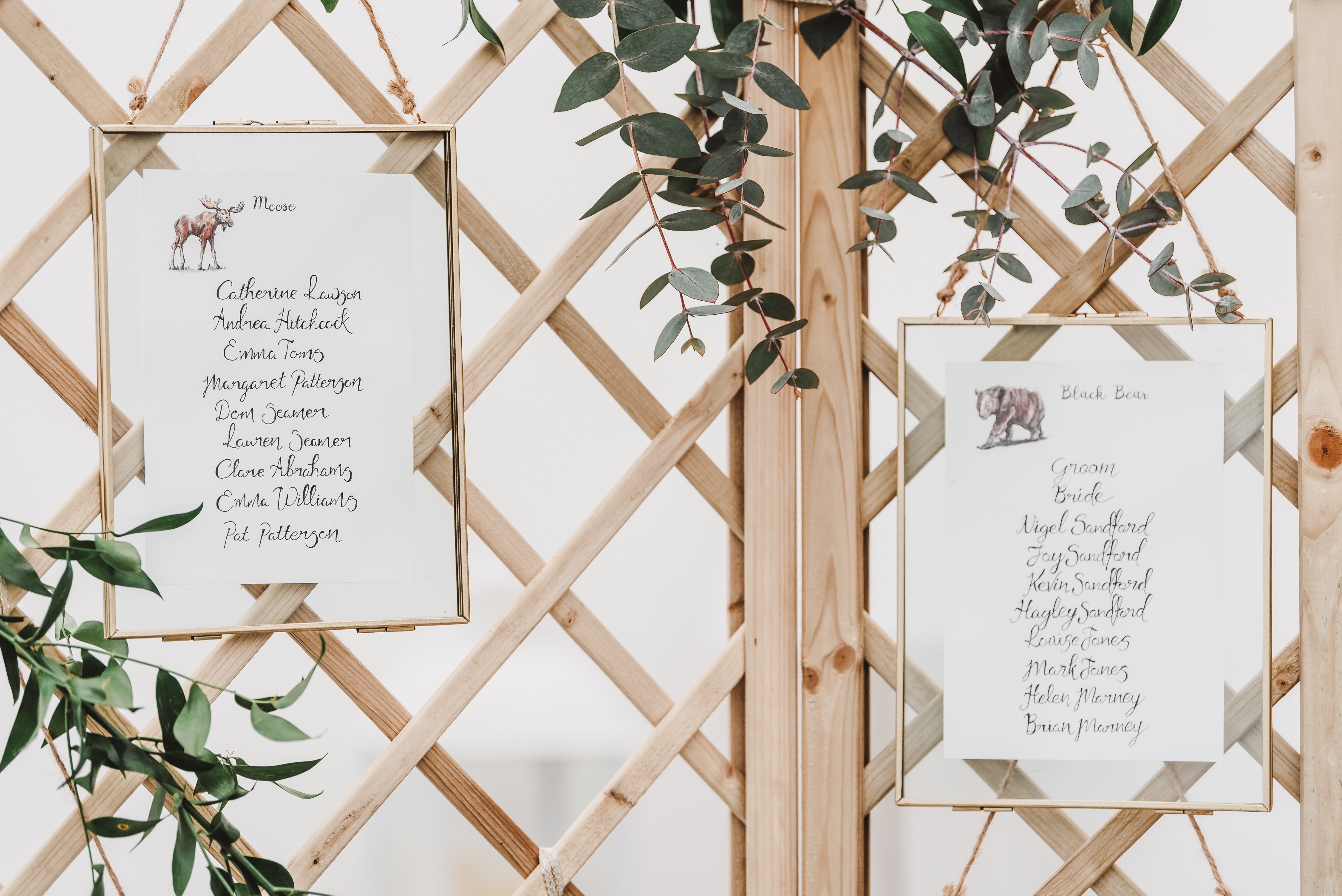
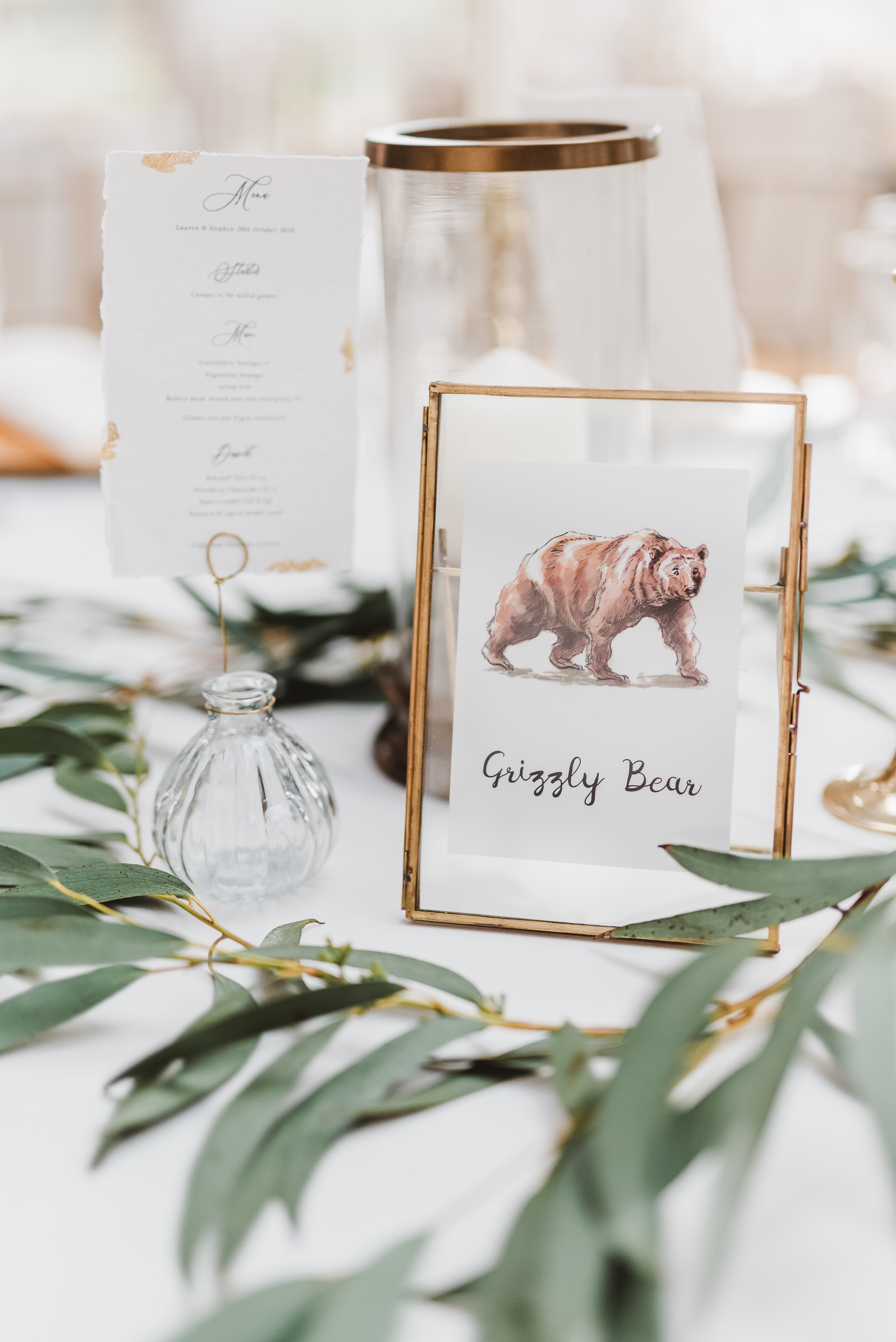
Sometimes custom projects come along that are so satisfying to work on from start to finish. Lauren and Stephen very kindly asked me for some illustrated North American animals for their wedding, which they then worked into their table names and seating plans.

The results were a mix of brush pen and ink, plus watercolours. Simple, quick and loose (read: fun to do!) but still cohesive as a set. This was the first time I’d done a series in a while, but I think it gelled well.

Illustrations printed and ready to ship

I was happy with my drawings once I’d passed them on, but boy did they come together with the gorgeous styling of the wedding! The photography by Georgi Mabee also showcased the event to stunning effect, so thank you to her for letting show off my illustrations with her photos.

Laura Carter IllustrationLaura Carter IllustrationIllustratorlaura on Etsy

Illustratorlaura on Etsy

Congratulations once again to Lauren and Stephen!

Laura

My Choice to use an Earthy Palette

Art, Creative life, Uncategorized

You may notice when you look at my art that it is often quite muted and earthy in colours, and that is a by-product of the materials I choose to use. I love bright colours in my personal life, but for my work I’ve chosen to go with a more muted colour palette, as it’s often better for myself, others and the environment. I prefer to keep my sustainable footprint as small as possible by working with found, recycled/rescued or upcycled materials where I can, and in particular ones that were made with as few harmful dyes as possible.

Of course, sometimes nature provides a way of working that gives spectularly pure colours (I’m looking at you, indigo), and some of the materials I’ve used happen to have been bright pops of colour, such as the off-cuts of industrial faux-leather I’ve used in my bags in the past.  More often though the less harmful dyes are of course, more earthy. I have used un-bleached cotton  and linen in things like my zipped pouches (I’m working on a new range!), which instead of bright white gives a lovely warm beige. Paper from recycled pulp is also often of mixed fibres, resulting in natural melange of soft colours.  I also love working with recycled paper for my lino prints and the handmade cards.

ACS_0007

Unbleached cotton for one of my hand-painted zip pouches

My pregnancy this year spurred me to make a change to my watercolour paint palette too. After a bit of research I am happy to have found what seems to be quite a varied palette with some rich colours, which is still less toxic to Baby Q and myself. Out went the obvious Cadmium hues and a few of the ‘older’ pigments (they’ve developed safer ones now). You can see a few changes I made in my swatch below. Scribbles look super professional, I know.

baby changes post 1.JPG

My adjusted palette swatches.

It’s not perfectly safe, but at least I’ve chucked out some of the scarier ones. No Vermilion-induced birth defects for us (it contains mercury)! I’d love to hear from you if you know any good resources for checking what are ‘safe’, or relatively safe pigments.

Here’s a recent painting I did for this year’s Christmas cards (the robin one was a very limited run… it’s sold out!)-

laura carter illustration robin

My biggest bug-bear is that I miss a bright red. The other hues in my core palette are very lovely, as is Indian Red (or Light Red, as named by some brands), which is the red I’m currently using. You can see the swatch tucked under where I’ve crossed out ‘Cadmium Red’, which I’ve stopped using. Light Red just misses that… pizazz that Cadmium has, and tends to muddy other colours when mixed. Light/Indian Red also varies from brand to brand. So again if anyone knows of any brighter, relatively safe reds, please let me know!

Back to work!

Art, illustration, Uncategorized

I’m back in ‘work mode’ after the holidays, finally.

Can’t wait to get stuck in with my ongoing and new creative projects, I’ve so many plans!

I’m trying to share my work more with the world this year, so that people can see what it is I actually do! Some projects are too personal to share, or I can’t share them yet, but here are a few pet portraits I was lucky enough to be commissioned for before Christmas-

All watercolour, and the little wooden plaque was gouache.

Do contact me if you’d like me to do something personal for you, human or furbaby!

Happy New Year, and here’s to a creative 2018.

Laura