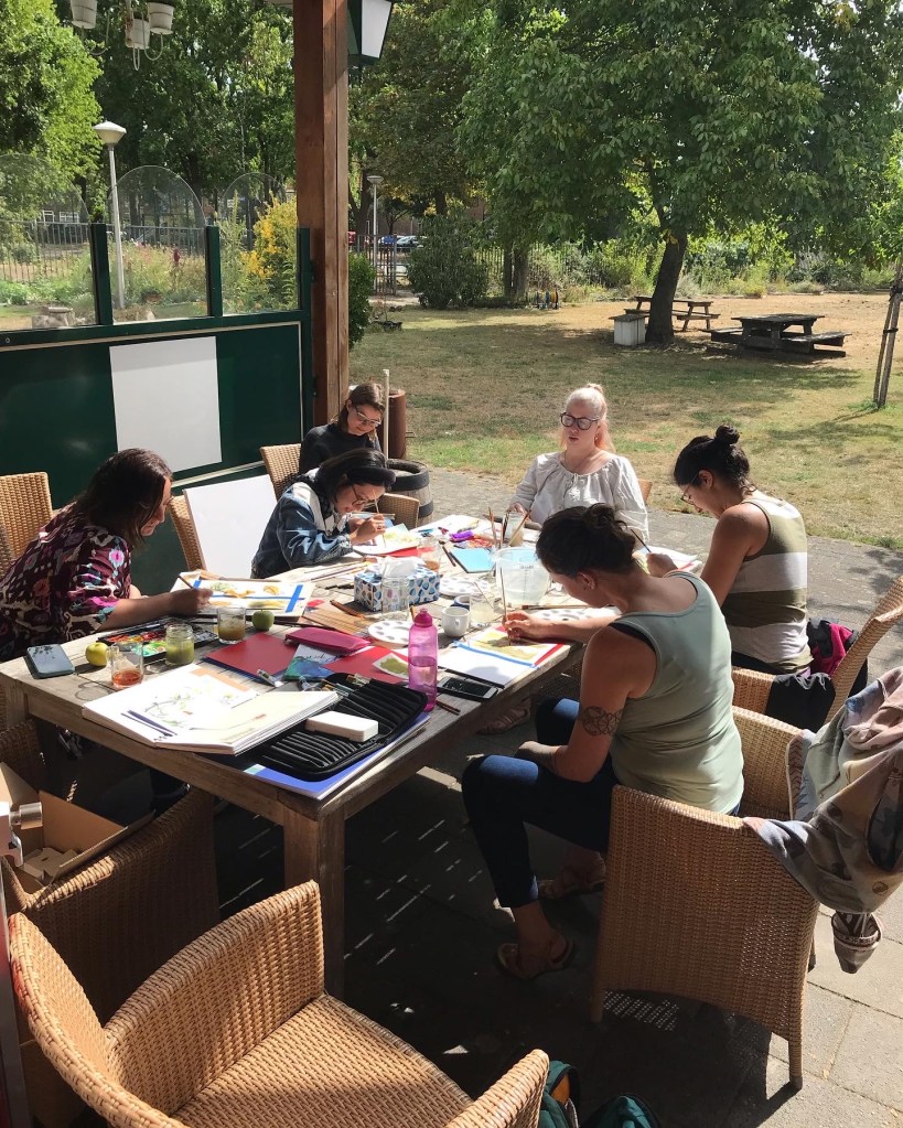
We’re back for another painting workshop at the Blokhut in Eindhoven, after the success of the first one! Saturday 24th September 10.00-12.00 with the theme ‘Late-Summer Botanicals’.
This one will be an actual lesson with tips and guidance on how I paint my botanical sketches in watercolours. Again suitable for both beginners and advanced watercolourists (in which case, feel free to do your own technique and just enjoy the company and creativity), all are welcome. We speak both English and Dutch.
Painting lesson Eindhoven 24th September
We have 10 sets of materials available for use, so get there quick to grab one. First come, first served. Coffee and tea available. Come on down for a casual creative morning.
It’s a free session, but donations for materials will be greatly appreciated. I’ll bring a tip jar ❤
I’m pleased to announce that you can join me for a watercolor painting event in Eindhoven! Myself and a couple of folks thought it a lovely idea to get together for a casual painting session, on location inspired by the lovely Blokhut garden, in the Irisbuurt.
Come join us!
Come join us for a fun painting session in the Irisbuurt Blokhut!
Open for beginners and experienced artists. This will be a casual session with no set instructions to follow, but tips and guidance will be available for beginners and anyone who asks. I speak both Dutch and English. Everyone is welcome!
Use our watercolour materials (10 sets available, first come first served) to make a couple of paintings of the lovely garden, or bring your own painting equipment and inspiration pictures. Materials for tonal sketching will also be available.
We’ll go ahead even if it’s raining, we can sit further under cover and arrange for botanical material on the tables to paint.
Having missed painting in person with people over the last few years, I’m very much looking forward to this get together!
If you’d like to RSVP to the Facebook event, you can do that here.
I’m going to be sharing more of my art-making and design process here, as well as my tips for anyone who’s interested.
My Patrons get full details on the process as it happens, as well as invitations for their input, and my newsletter gives a monthly run-down of the best bits as well as a heads-up on when things will be available to purchase in my shop.
I’ll be using this space to curate the processes of my most interesting and juiciest projects, and sharing any experience that I think may come in handy to anyone else. I know I’m always eager to see the design process of other illustrators, out of curiosity and to see if I can pick up any useful tips.
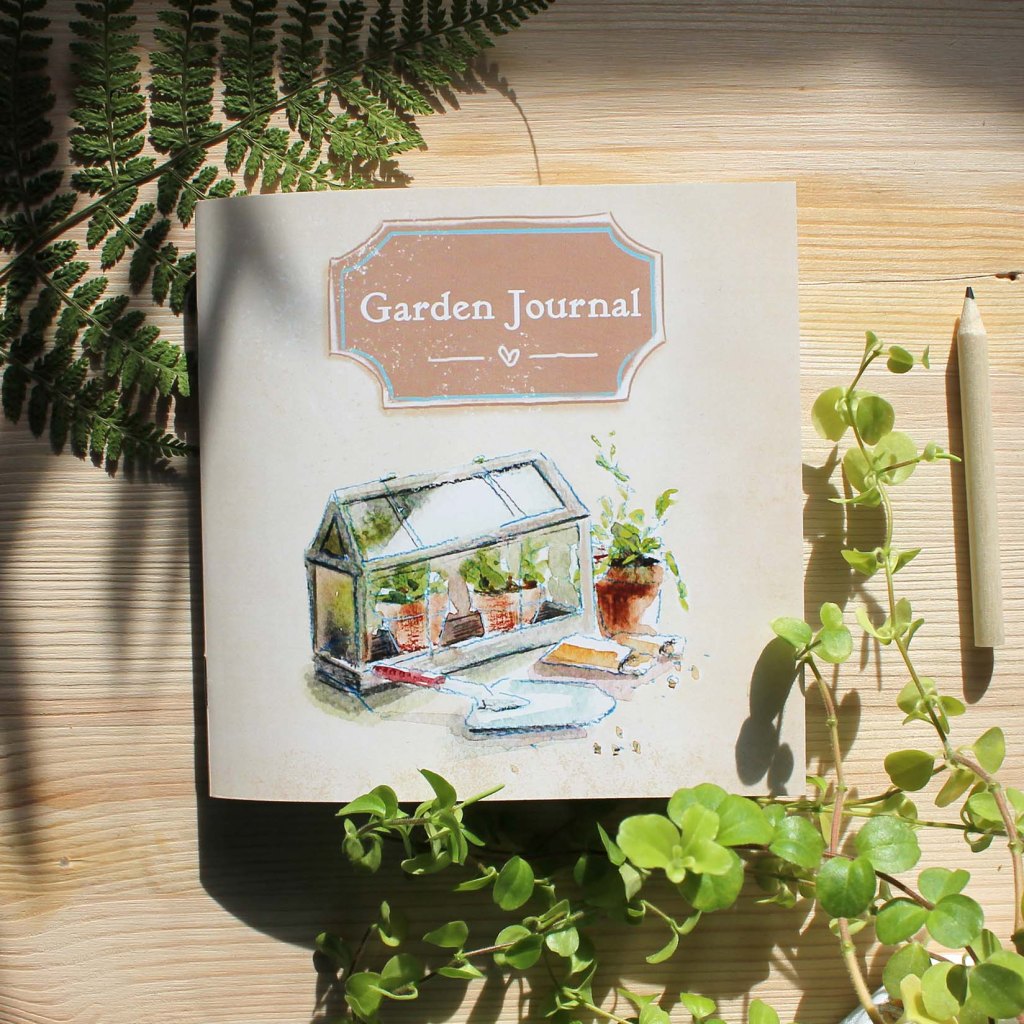
I’ll start with my pocket Garden Journal. This was a self-initiated project that I made basically because I wanted to use it myself!
Run-down of Development Steps
Pencil thumbnails and brainstorming ideas
Scribbly first ideas in my notebook, with teeny tiny thumbnai ideas
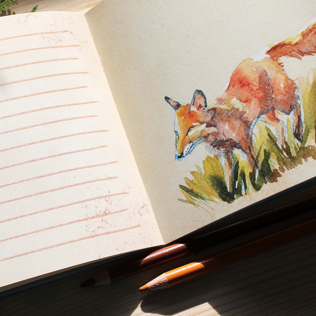
Watercolour spot illustrations, then scanned and digitally cleaned up
Cleaned up bird-feeder spot illo
Each page made up and imported into a digital page template
A selection of my finished pages
Mini thumbnails of all finished pages, placed in a layout overview document
Mini layout of thumbnails for an easy overview, to check it all works together
All pages assembled in a multi-page PDF template, then sent to the printers
The final printed journal coverA peek at an Autumn pageThe final printed journal
Tips / Notes to Self
// A thumbnail overview is useful~ Even a ‘blank’ journal has a sequential layout that requires pacing. A zoomed-out overview lets you check out that colour-schemes and page layouts all have room to breath and are varied enough to be interesting. Especially with so many pages (mine has 44); that’s a lot of room for error!
// Leave lots of time for a multi-page project~ Give yourself a roomy deadline. I knew what I wanted for the finished journal from the start, as gardening is also my hobby, but if it had been an unfamiliar subject I’d have needed a way longer planning and research stage. I’m also naturally bad at time-management so I had to have a lot of patience when things took longer than I initially anticipated. On top of that it was also a new document format, being so many pages, in a publishing program that I have barely used. Patience!
// Ask for a proof version if you have time~I DID actually go for a proof this time, and in the end it wasn’t needed. I ended up making no changes. I think this was down to luck though, and the fact I was making up a booklet to my own requirements. If it had been a commission, or anything with any word count at all (I think this journal has maybe 60 words in it, mostly on the back), then I’d definitely double check before approving the full run. These things cost money, especially with the cost of paper these days, and it’s just not worth throwing your money away. Enquire with your printers, if your print run is large enough then they may be willing to throw in a physical proof print for free.
This journal was certainly a challenge, and if you’re thinking of making up your first illustrated book I’d definitely recommend starting with a familiar subject matter as an anchor to grow your skills around.
If you have any questions, or there’s an aspect you’d like further explanation of, then feel free to comment below!
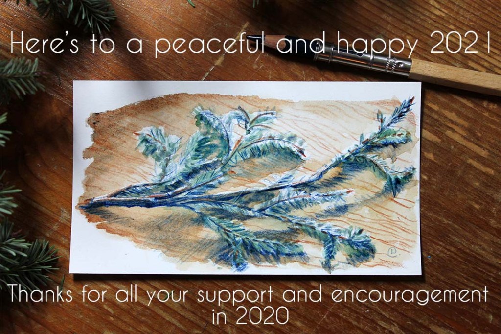
I’m crossing my fingers and toes that this year is a steadier ride for everyone than the last.
My business couldn’t have made it through 2020 without the amazing support and encouragement from you, so a big thanks to everyone who bought anything, pledged to my Patreon (Patrons are superstars: without them I’d have thrown in the towel last year for certain), and those who shared, simply ‘liked’ or commented on my stuff on social media. All very important support, thank you. I was able to launch a Patreon page, invest and test new products, invest in a new graphics programme (Affinity Designer) to streamline my work, and even take a bit of time to dabble in some personal sketches. I feel like I could get my business affairs a bit more in order, finally!
I’m also here to mention that I also have plans for this year. How fast I can roll them out depends on what happens with the latest lockdown, and when my son can go back to childcare, and also my therapy schedule. I think we’ve all learnt to be a bit more flexible over the last year though, so I’m sure I can re-jig and fit most of my plans in if needs be.
I have a few new products sat here waiting to be assembled, photographed and listed, which I’m already proud of even if no-one else is interested in them. I already plan to use some of them myself.
On the ‘sustainability’ front I’m also dipping my toes in with a local supplier who hold themselves accountable when it comes to the environment. I’ll be trying new cards and textile products this month, actually.
Recently I conquered the seemingly over-complicated task that is setting up Instagram Shopping. I say ‘seemingly’ because I think the complications were mostly down to my ineptitude with tech, and me misunderstanding what the instructions exactly were telling me to do. It’s probably not that difficult if you just follow, and most importantly, understand all the instructions to the letter.
I was determined to set up Instagram Shopping because a surprising amount of direct sales and traffic comes from my Instagram profile. Still a very small amount, but hey I’m working on it, and this is a step to making it even easier to buy from me.
It doesn’t help that, as I’m selling via Etsy, I needed to set up a Facebook catalogue first, THEN integrate that with Insta, get everything verified, etc. I wasn’t even on a full Facebook Business profile before this, which is the very least of what is required.
My shop catalogue finally set up in Facebook Business manager.
Also, I tend to lose the ‘help’ articles amidst my million tabs open in my browser… anyway, I did get there in the end.
For those interested (totally not leaving this here for my own reference when I lose the tabs again), here is the Etsy help article you need to follow to verify your Etsy shop account with Facebook and Insta. You’ll also need to have set up a Facebook business page, and also have a ‘business’ profile for Instagram first. Clicking on ‘settings’ in your Instagram will take you through to your profile type, and if you have a business one set up, you can click through to ‘set up Instagram shopping’. Then Instagram admin will review your Facebook Business profile, which takes about a week. I didn’t expect this very frustrating week’s wait, but I just wanted to get this all done an dusted, after already going through so many different steps. Finally though, Instagram will notify you in app and you can ask it to email you, asking you to finish and verify your linked (Etsy) domain over on your Facebook Business page.
My goal: my products on Instagram with clickable shopping links!
Follow the Etsy set up guide to the letter ESPECIALLY when entering the URL format for products in your catalogue (otherwise you get all sorts of security warnings), and you can finally create a Facebook catalogue and then tag your items over on Instagram. Phew. I hope you find it easier than I did.
Let me know if you have any questions and think I can help!
I want to talk about being an immigrant artist with a chronic illness, and how that has shaped my life and work over the last ten years that I’ve lived here in NL. I just touch on my own experience, and it feels like a good time to talk about it now. I’ve just finished jumping through the hoops (I hope!) of applying for my first residency document as a newly non-EU national, and have also finally had my doctor give an official diagnosis of fibromyalgia, after ten years of living with the symptoms. I’m in a good place for a bit of self-reflection!
I’m an immigrant, and proud of it. Call me an expat if you like, I fit that bill too. But I will never shy away from describing myself as an immigrant, because I think a lot of people are too quick to view that term in a negative light, when in fact expats and immigrants are exactly the same thing.
People emmigrate for all sorts of reasons. I’m incredibly lucky that I moved for relatively minor reasons, and it was not an absolute last resort, as is the unfortunate case for many people (hello upcoming global warming-induced mass migration). I was at a low point with my health, moved from England to the Netherlands for love, settled, then we broke up. It was amicable, don’t worry! And I’m now settled in N.L. with my man and my little son Q, so all’s well.
Q Bean, making himself at home
In terms of my career, well, being an immigrant adds its complications. When I moved here I was quite ill. It turns out I’d just had a burnout and developed fibromyalgia, neither of which I’d put a name to until a few years later. Bad health meant I struggled to find paying work (hello, I have an art degree. Talk about awkward!), get out to make friends or generally ‘fit in’. For years I struggled, when actually I should’ve been focusing on recovering and making myself better, not trying to please everyone else and The System. Don’t get me wrong, I think I’ve landed in one of the most diplomatic and open-minded countries in the world, and know that other people haven’t been so lucky if they’ve chosen, or been forced, to move countries. Just, being an artist AND an immigrant made things doubly hard. Not exactly condusive to a ‘steady income’ situation, and when you throw in chronic illness… I could barely get out of bed at one point, for goodness sake. But the point is, I tried. I worked very hard. I made several short-lived but very determined attempts at jobs that I was ‘allowed’ to do, mostly physically. Each one ended in exhaustion, or just a flat-lining of my health at rock bottom. I just wasn’t healing, mentally or physically.
These last few years have put me on good footing, both in my art career and personal life. Still, Eindhoven has never really felt very ‘me’, and the three of us are still looking for a place to settle in to a forever- home, which will take a few years to save for. Meanwhile, I’m trying harder to appreciate what postives Eindhoven has to offer me as a city. As a bumbling traditional artist from rural England, it is feeling more accessible and vibrant and less stiff and pretentious than it did in the past. Perhaps it’s me who’s reaching out and connecting more (ok, social-distancing aside). It has a huge expat community, but I’ve always felt they were in a different world to me. A lot come from ‘tech’ backgrounds, and I’m a complete technophobe. Part of being an immigrant is adapting though, and maybe I’m just finally overcoming my resilience to change, and to my belief in myself, that I can and am indeed ALLOWED to fit in. Isn’t imposter syndrome great? I also finally reached out, asked for and received an official diagnosis of fibromyalgia, which was a big step. It has been so influential in my ability to work and fit in here. Perhaps I’m ready to face the idea that having a chronic illness doesn’t define me, but is key in how I adapt to living my life. Anyway, things are steadying out, and I’m finding more ways to show the world (including Eindhoven) that I’m here and that I’m creating work. I hope anyone else in a similar situation, immigrant or creative or with a chronic illness, or a hybrid of all of those as I am, can see their own strengths and value and is not afraid to face anyone who talks them down. I’m here if you want to talk about it!
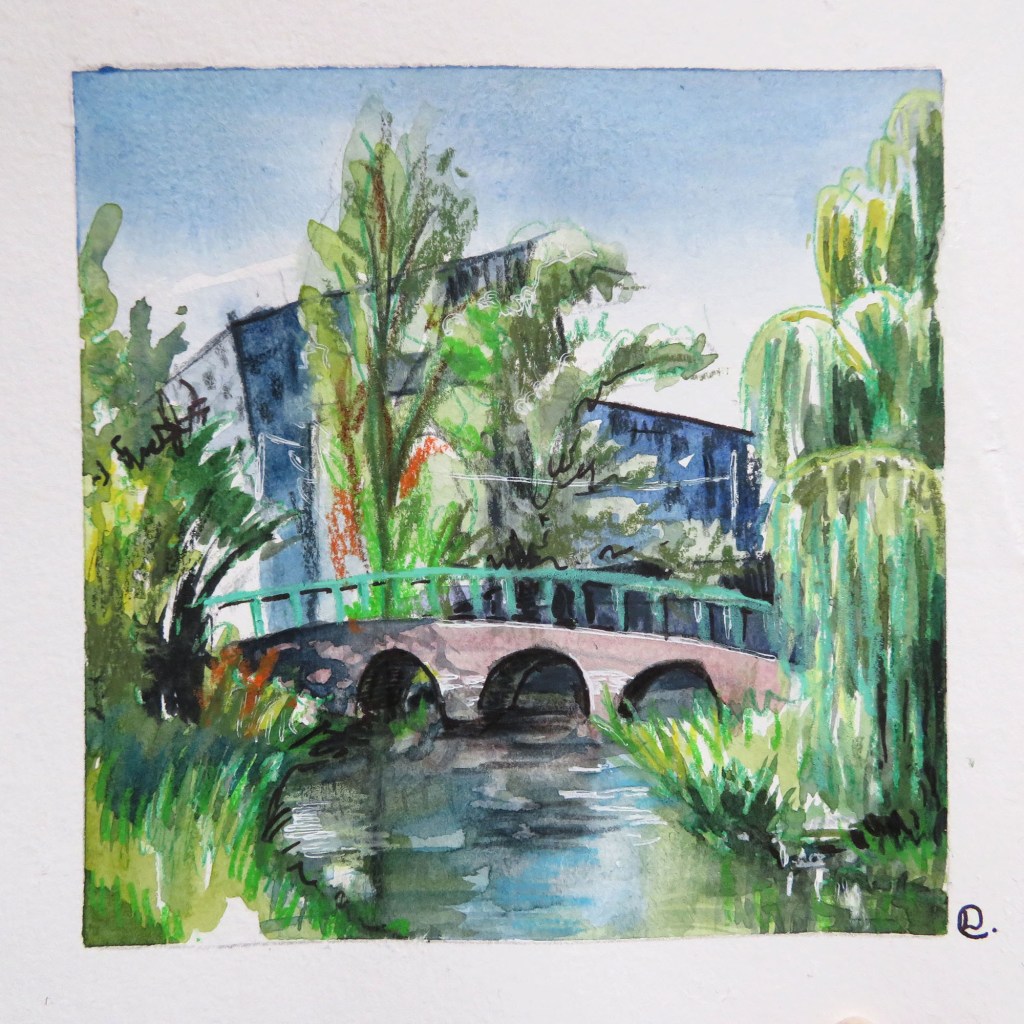
Eindhoven urban sketch of Van Abbe Museum
It has been people and their attitudes that have really made the difference between the first difficult years here and now. The other lovely immigrants at the naturalisation course, the friends I made around Eindhoven, my ex and his family who were kind enough to take me in, and lastly my now-husband and his wonderful family. My own British family and friends, who are all so positive and just plodding along doing their thing, and are there for me when I need to connect with a bit of home, no matter what is going on in their own lives. Britain and the British will always be my origins, my history. Immigrating never meant forgetting or trying to replace that slightly shambolic, eccentric and diverse rock and root of all of me. It forms the basis of my understanding of others, here, there and everywhere, and feeds in to my growing knowledge of human beings, my creative response to the world at large, and what being an immigrant can mean and provide society in these turbulent times. I’ve weathered xenophobic discrimination (only mild; I know lots aren’t so lucky) and will continue to reach out to connect and absorb the culture around me, whilst keeping my heritage in my heart. I will always be English, and I will always, always, take milk in my (Yorkshire) tea.
Big love to everyone,
Laura
P.S. If you’re a creative around Eindhoven, do drop me a line, tell me your story or just say hi! I’m up for connecting more locally. See above 😉
We celebrated women of all kinds yesterday, with another successful and fun International Women’s Day fair!
Organised by the C.L.O Eindhoven and held at the Parktheater Eindhoven, it was a lovely and vibrant event as always.
Full of interesting conversation and women entrepreneurs (plus their families who are always welcome), it is a celebration of women, and promoting gender equality. I definitely recommend coming down next year, whether you’re a woman or not!
Here’s a selection of what was to see and do-
Dressed for Success Eindhoven
My stall
Resin and Wood Arts and CereMin
Miss Eindhoven
De Viersprong
International Women’s Day 2020
Food plaza
Marqueza Bijoux
Ioana Caraba
Anklet bought from CereMin
Plus if you’re a female entrepreneur, it’s a great chance to meet with other like-minded women. Thanks for all who came down, and for your kind words and support for my own small business!
I’ve always been committed to running my business and making art in the most ‘eco-friendly’ way possible (read more here). ‘Eco-friendly’ is a bit of a blanket term, but I think it’s important for all makers to take in to consideration, no matter what your budget-limitations or what products you make. It’s a tough and on-going challenge, but I beleive even small improvements to processes or materials will help.
One of the recent changes I’ve made is to my paper choice for my prints.
First I tried switching over to recycled, uncoated paper. Still on my beautiful ‘photolitho’ printer the prints were subpar, muted and undefined. Such a disappointment! I had desperately wanted this to be the solution, but I am also committed to producing reproductions that do the originals justice. Another aspect of sustainability that I value is ‘quality’. Better to buy one beautiful, archival print and have it hang for decades, rather than chucking it in the bin after a month. At least in my book.
Look at how vibrant the left-hand prints are, on my usual paper! I wouldn’t have been happy selling the prints on the recycled paper, seen on the right. It might have worked for a different style of illustration, or something where a warm muted look was required, but certainly not for these.
After that disappointment I spent ages trying to research quality paper for prints that have at least a nod to decent environmental standards. Let me tell you, that’s very difficult.
At last I settled on Hahnemuhle fine art paper. I was a bit reckless and didn’t even try a sample, just went straight out and bought a whole pack (hello €€€). I’m so glad I did!
The results are gorgeous, vibrant and of decent giclee quality with a watercolour paper texture.
Zebra illustration print by illustratorlaura
Meerkat illustration fine art print
Hahnemuhle were one of the few companies that I came across that have a fairly transparent breakdown of their efforts to be ‘eco-friendly’. You can read more here.
// SALE! //
To mark my success with another step in my ongoing ‘sustainability’ journey I’m running a sale on all prints in my Etsy shop! All prints will have 20% off (discount already applied) running today till 3rd December, yay! I’m making way for all prints going forward to be on the Hahnemuhle paper. My existing prints in the sale are also vibrant and on beautiful heavyweight paper, don’t worry!
I’ve also added my Christmas section goodies into the sale, as I’d like them to find new homes so I can make some more :*
Me and the fam took a little trip to Yksi Expo, situated in Strijp, Eindhoven. It focuses on circular and sustainable design.
Seeing as sustainable design is a passion of mine in my daily life, and an aim in my business one, I’ve been interested in seeing this space. It’s worth a visit if you’re down in Strijp S.
Yksiexpo
Re-using coffee by products for a tea towl, Lena Winterink
Coffee towel, Lena Winterink
There is also a lovely little shop (full of sustainable and zero-waste products of course), and a little cafe called Tea Stories. BTW they sell really good gluten-free (and I noticed also vegan) chocolate cake!
Sustainable design shop
Zero Waste Zone
Zero-waste products
We stocked up on lentils in our re-usable organza bag. You can bulk-buy pasta and other dried goods here.
If you want to get involved in the circular design/zero waste scene in Eindhoven, they are holding an end-of-summer party on Aug 31st. You can contact them here to find out more and get tickets.
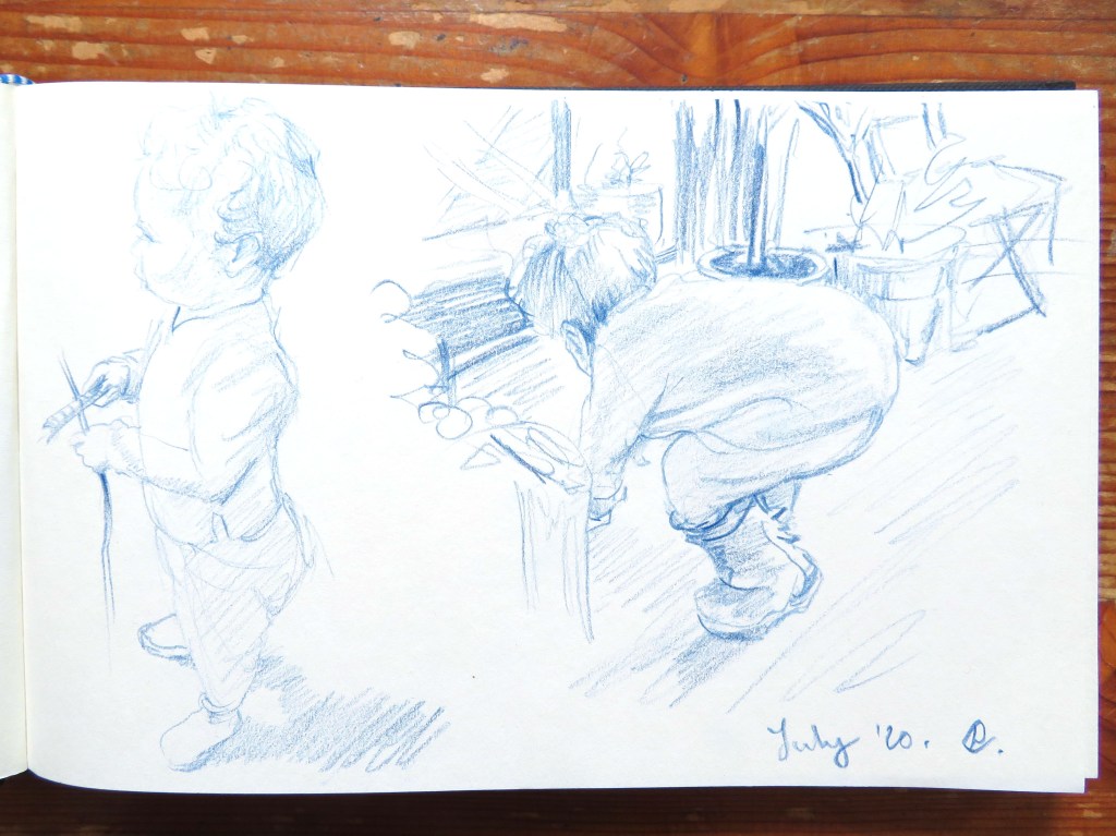
Strijp itself is a good location for sketching, though I don’t get out there as often as I’d like to do that. Managed to do a quick little one, with my little one, baby Q, in tow.
Quick urban sketch (and yummy gf cake)
My little one
I’m planning some more products with upcycled fabrics, which is a good way to cut waste. I’ll keep you updated!
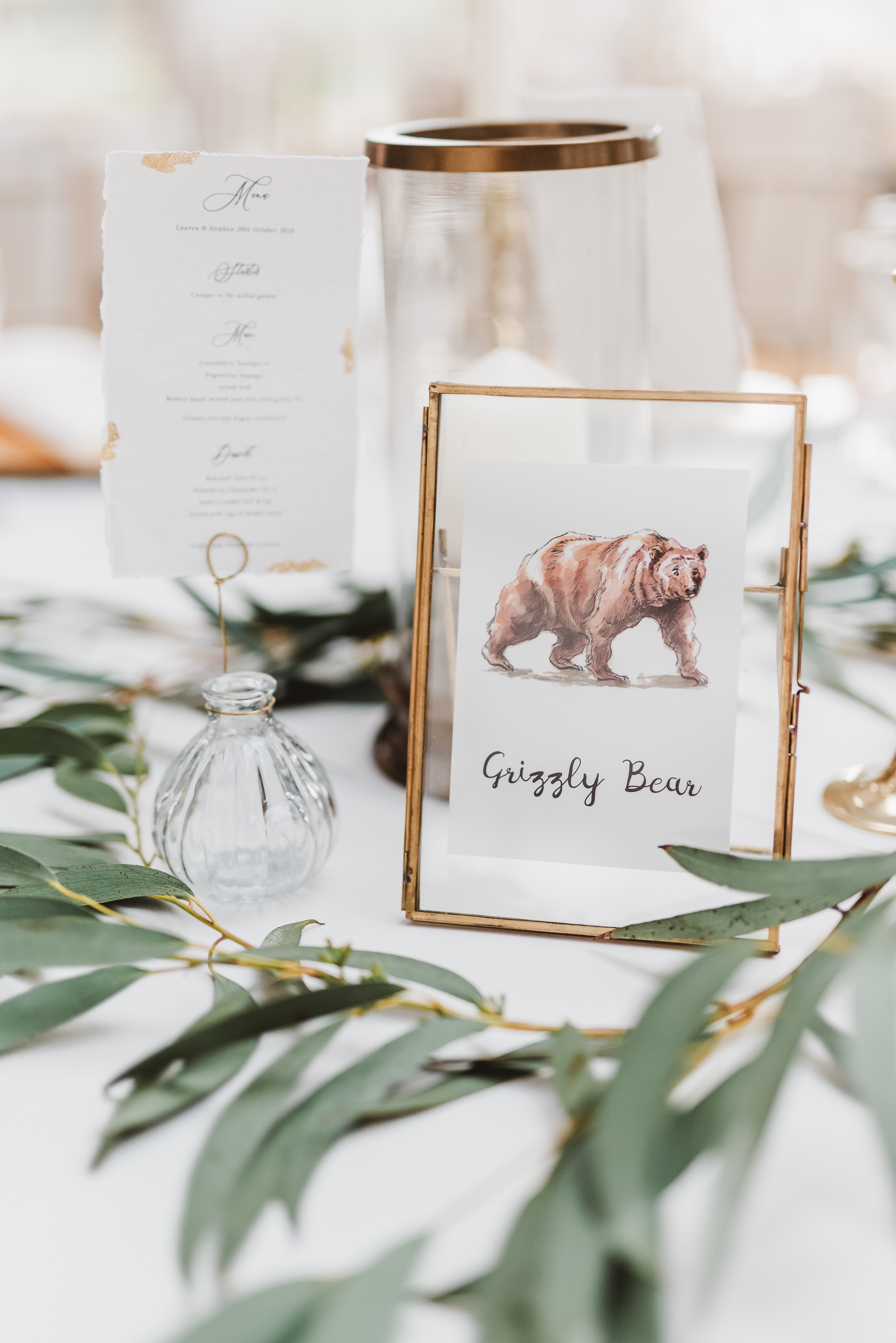
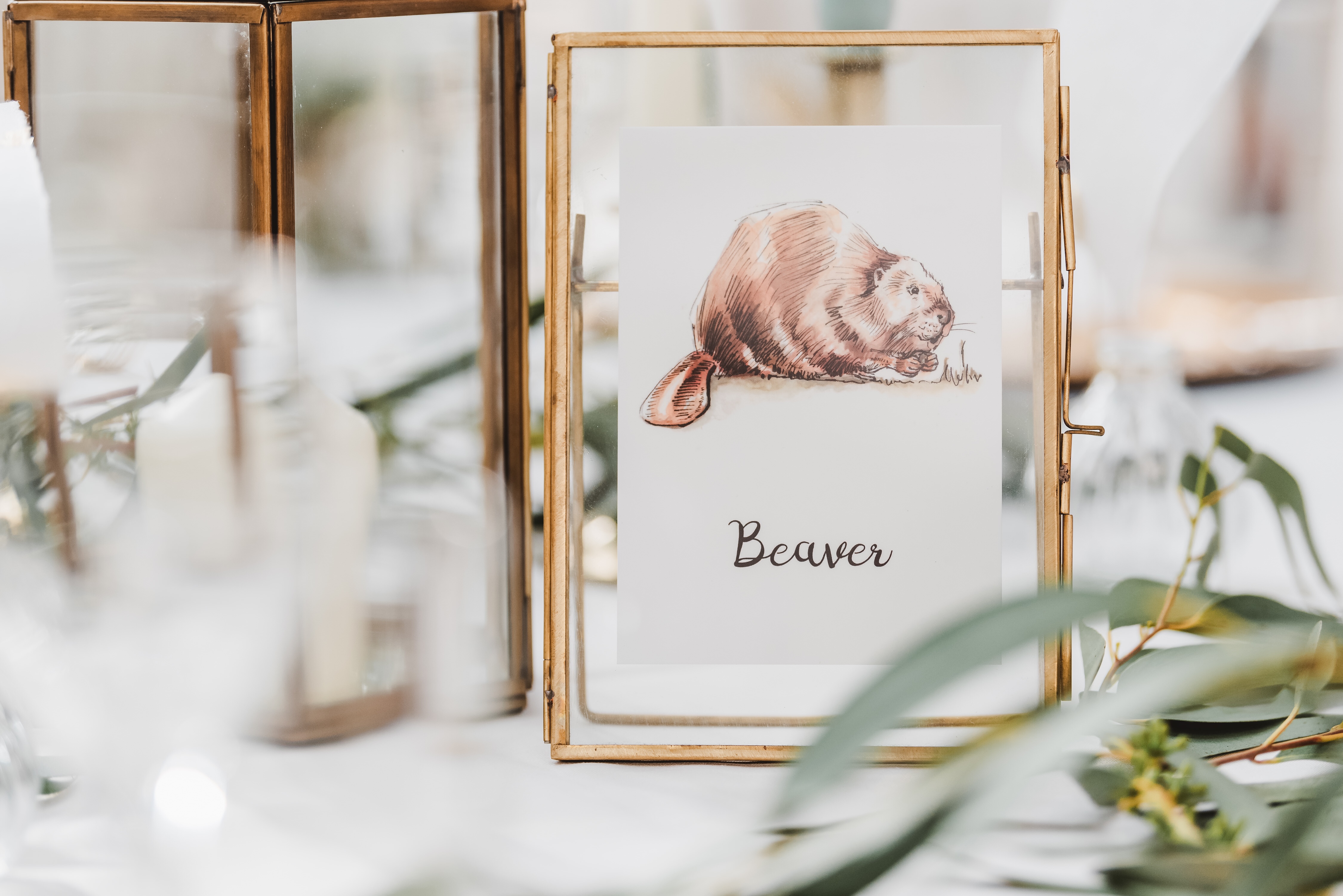
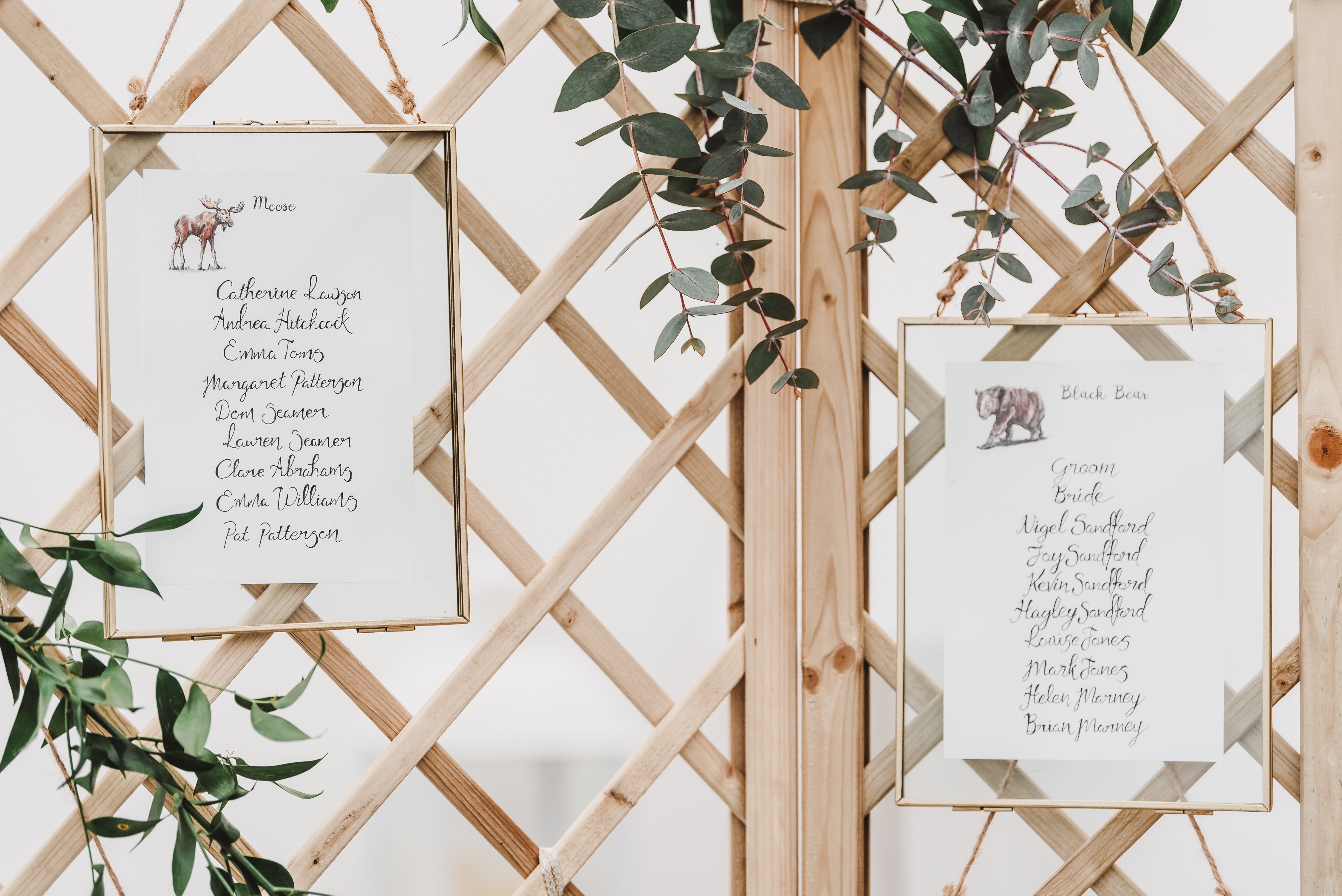
Sometimes custom projects come along that are so satisfying to work on from start to finish. Lauren and Stephen very kindly asked me for some illustrated North American animals for their wedding, which they then worked into their table names and seating plans.
The results were a mix of brush pen and ink, plus watercolours. Simple, quick and loose (read: fun to do!) but still cohesive as a set. This was the first time I’d done a series in a while, but I think it gelled well.
Illustrations printed and ready to ship
I was happy with my drawings once I’d passed them on, but boy did they come together with the gorgeous styling of the wedding! The photography by Georgi Mabee also showcased the event to stunning effect, so thank you to her for letting show off my illustrations with her photos.