This year I’m excited to be using the journal I designed for recording and planning my own tiny balcony garden, so I thought I’d review how well it works and share my thinking for further product development. I had a display copy sitting around so I thought I might as well put it to use. They’re almost all sold out ( one left in the shop, along with a couple of the plastic-free kits) and I’ve had great feed-back so far. Time to see if there’s room for improvement before I order another small batch! Sit tight for a glimpse of my actual gardening attempts for this year too, for a space approximately 2x3m.
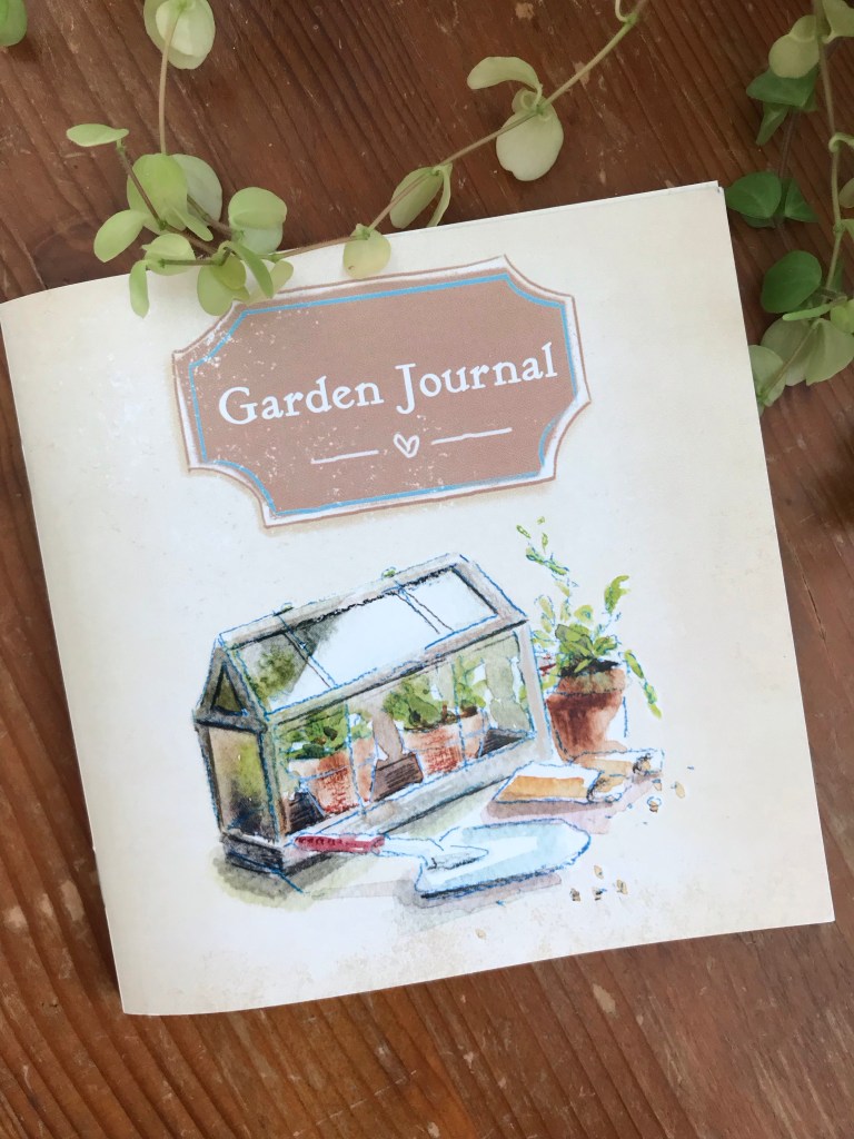
I find the format very handy, it would slip nicely in a small bag if you have an allotment or need to carry it if you have a large gardening space, for example. I don’t have to carry mine far though, and I enjoy it sitting pretty on my desk.
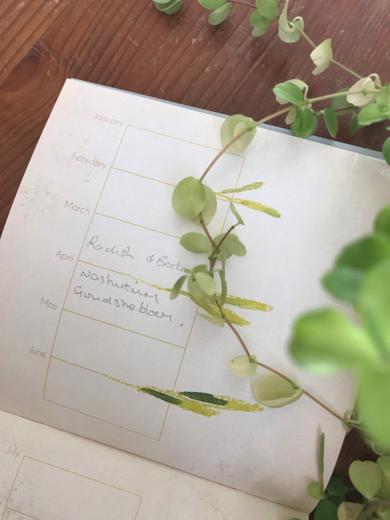
I’m happy that a lot of the pages are versatile and adaptable to your own way of gardening. This timeline could be a blooming timetable, sowing schedule, or ‘to do’ list for example. The paper is smooth and thick, and I was able to erase my graphite notes when I changed my mind after trying to crowd too much in to April!
I would love to make a hardback book with replaceable pages, perhaps a clip-in folder style so you could use it year after year, but it wasn’t financially viable and also this version is more portable. If you only have a small space, as lots of Urban Gardeners do, this smaller style fits better. A small collection will still be slimline and showcase your efforts over the years.
I’ll put photos in when things start growing, but it’ll make a cute little photo album. There’s a rough seasonal progression to the images and colours from front to back, Spring to Winter, which I’m very happy I went with.
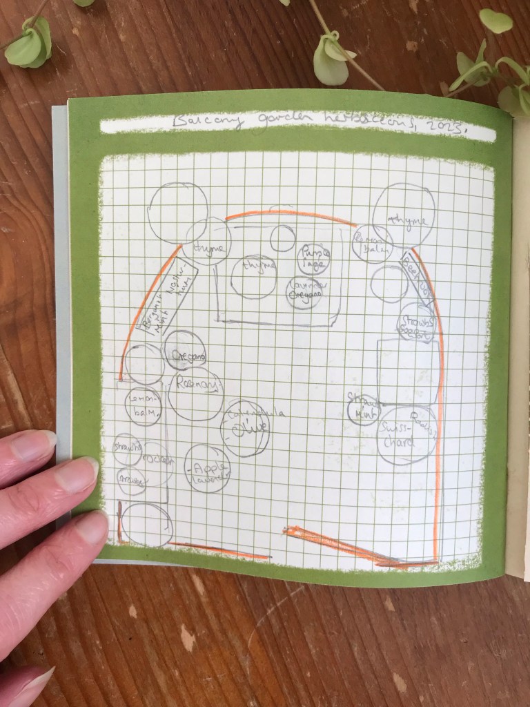
This page above I particularly love, and realise it would be handy to include more of, for example for a planting schedule for each season. At the moment this single copy is very handy.
If anyone has any suggestions for version two, I’d love to hear them, whether you have a copy or just have an idea. I would love suggestions on products to add to my plastic-free gardening range as well, as gardening is such a big passion of mine and I love it when people buy these as gifts for other gardeners. I’m hoping I’m bringing a bit more fun and satisfaction to any garden-lovers. I’m happy I’m managing to keep it locally printed, sustainable and lovingly designed and packaged too.
This journal started as a way for me to still live out my gardening passion, one story up and in the middle of a city. I hope I can encourage people others to keep at it and make the most of any space they’ve got even if it’s just a windowsill.
Here are a couple of snap shots of my balcony right now, with most things still dormant but a few signs of Spring.

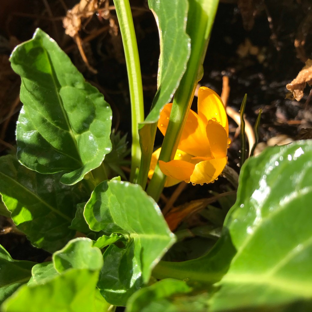
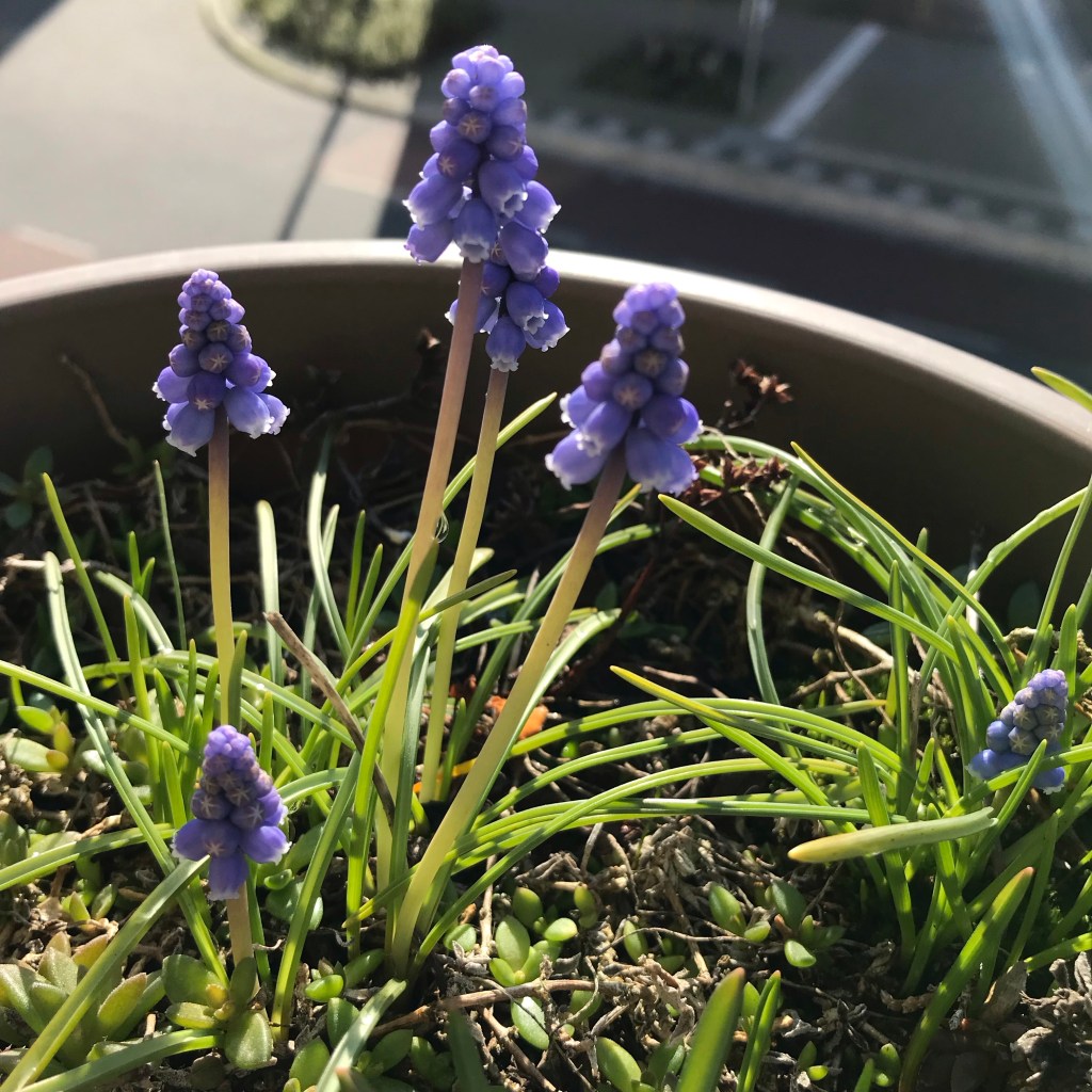

I can’t wait for it all to wake up, and I hope to share my gardening (and illustration progress with you later in the season!
Laura


